
European style pulls from farmhouse restraint, modernist precision, and centuries-old formality across a dozen countries, which is why the 36 ideas here range from a checkerboard floor in builder-grade tile to parquet herringbone laid by hand.
Pick the approach that matches your architecture: arched openings and terracotta tile suit Spanish revival bones, while flat-panel cabinetry and handleless doors fit postwar construction.
1. Neutral Colors and Bold Accents
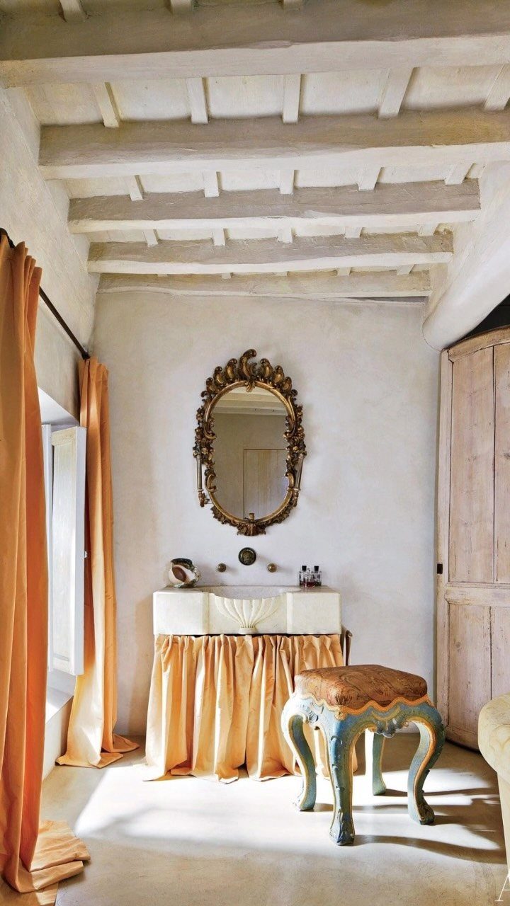
A pale foundation lets a few saturated colors land with real weight. Cream, white, or soft plaster tones cover most surfaces, and then one or two rich hues arrive as textiles, frames, or pottery.
The contrast feels intentional without competing for attention. A burnt orange curtain or a deep ochre pillow stands out against quiet walls the way old European homes layer collected color into rooms built centuries ago.
Pick 1 or 2 accent colors and repeat them sparingly. The restraint keeps the look anchored.
2. Natural Materials
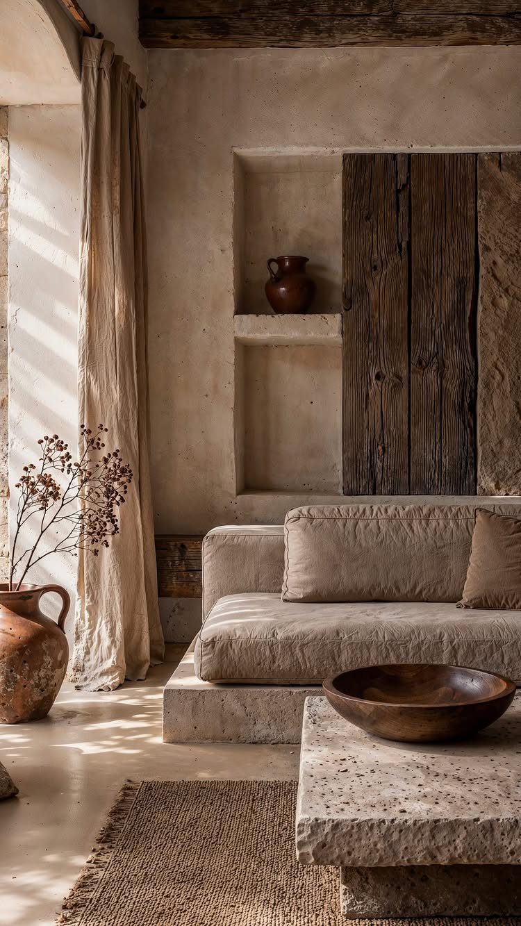
Linen, stone, jute, raw wood, and unglazed clay build a tactile foundation that wears well and ages better. These materials show up across centuries of European interiors because they last and because they feel good in a room.
Wooden beams, whether structural or applied, bring warmth overhead. Plaster or limewash walls soften light in a way flat paint does not.
Start with 1 or 2 natural materials and let them repeat. The cumulative effect matters more than any single piece.
3. Gallery Wall of Collected Art
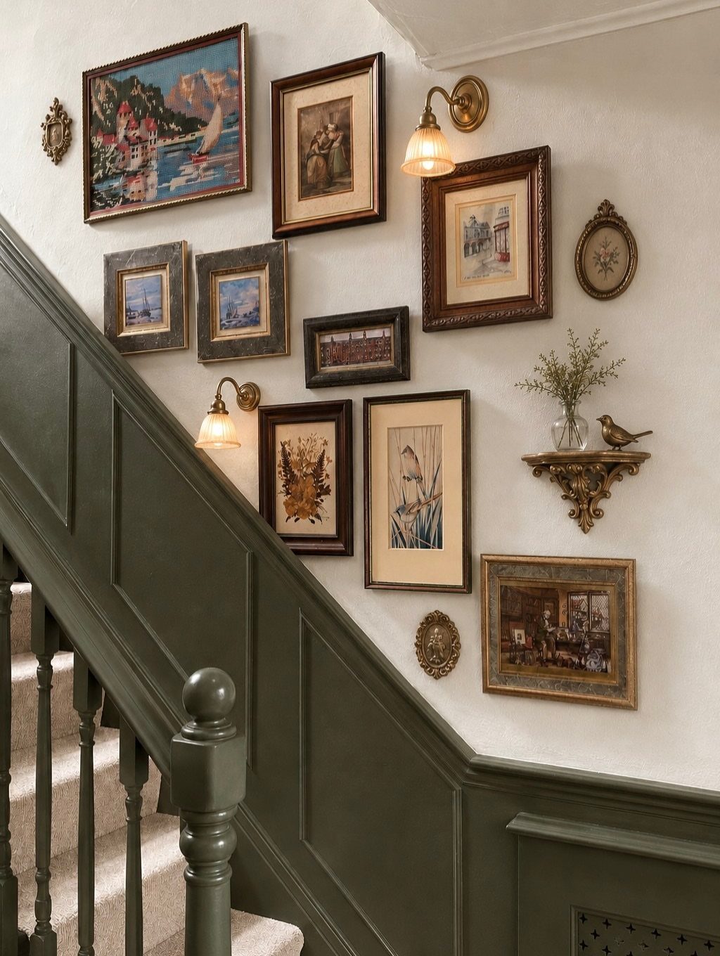
Framed paintings, sketches, and prints hung salon-style fill a wall with layers that look collected over time. Different frame finishes, uneven spacing, and varied sizes give the arrangement a personal, less formal rhythm.
Begin with a central anchor piece, then work outward.
Mix landscape and portrait orientations, and leave narrow gaps between frames. Sconces mounted on the wall above the grid add light and reinforce the layered feeling.
This works well on a staircase or hallway where you pass the wall often. The variety holds up to repeat viewing better than a single large piece.
4. Neutral Sofa with Rich-Toned Cushions
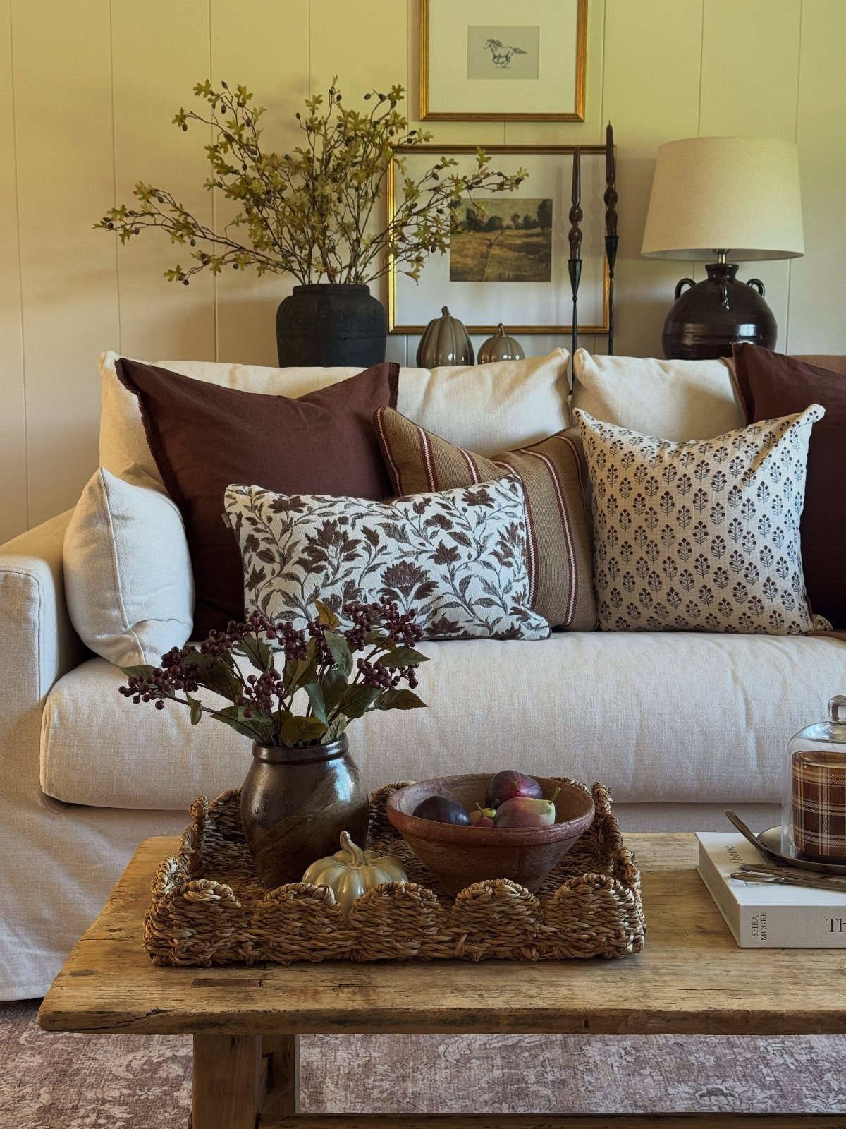
A linen or cotton sofa in cream, ecru, or pale gray stays neutral enough for any room, and cushions in cognac, rust, or deep olive bring warmth without locking you into one palette.
The mix reads as intentional when the base color stays light and the accent cushions share a similar depth of tone. Patterns work best as 1 or 2 pillows among solids.
Change the cushions seasonally or as your taste shifts. The sofa itself stays adaptable, and the richer tones keep the look from feeling flat.
5. Architectural Moldings
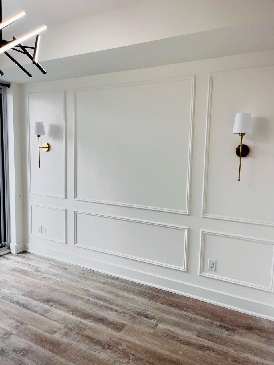
Picture-frame molding applied to a flat wall gives a room architectural weight without tearing anything out.
Rectangles or squares laid out in a grid suggest paneling or older construction, and the profile can be as simple as flat stock or as detailed as a traditional chair rail and cap molding.
Paint the molding and wall the same color for a subtle, tonal effect, or use 2 tones to emphasize the frames. Spacing follows the proportions of the wall; taller panels suit high ceilings, and smaller grids fit tighter spaces.
This is a renter-friendly update if you use adhesive backing or painters’ caulk instead of nails.
6. Wood Tones
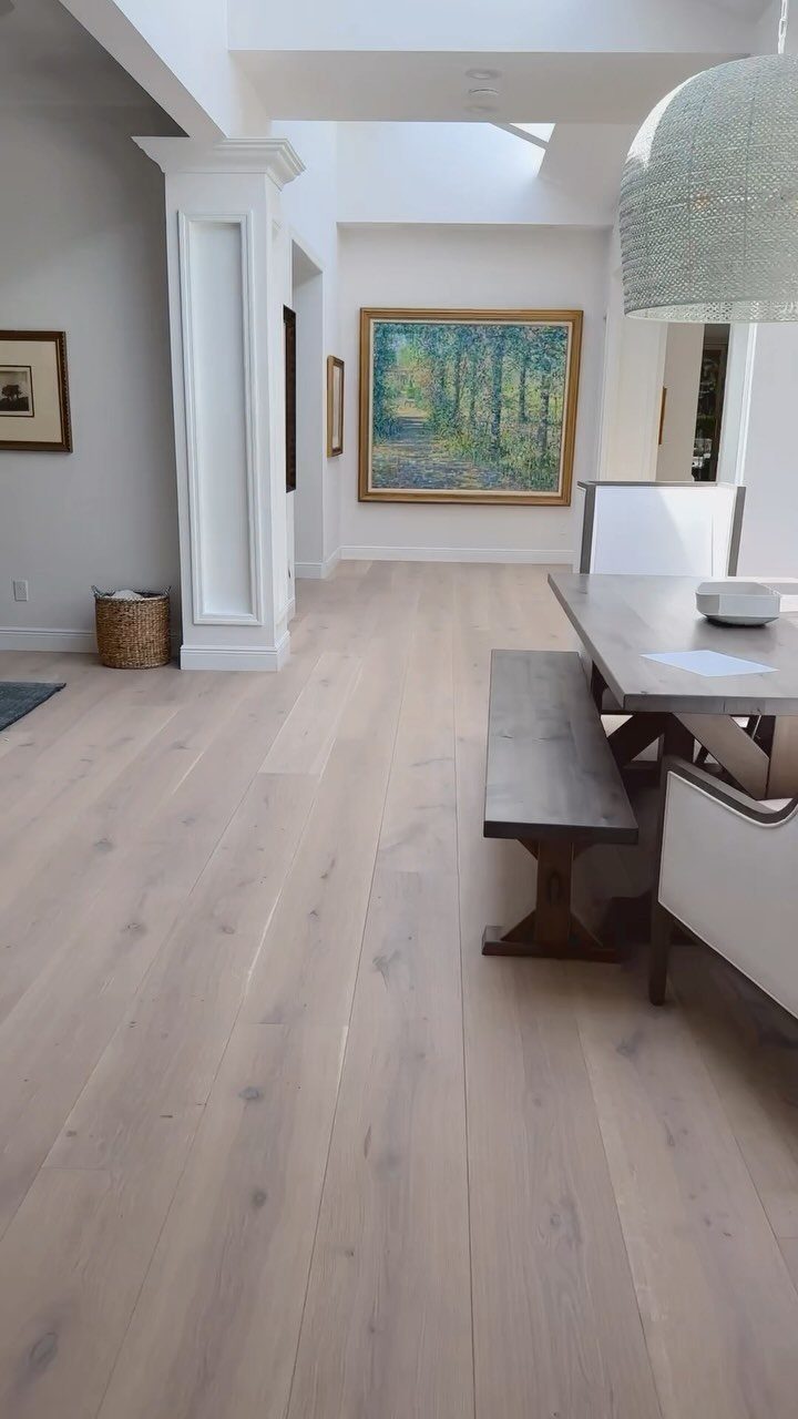
Wide-plank floors in oak, ash, or pine bring the grain and color variation that define European interiors, from Scandinavian minimalism to French farmhouses.
Light to medium tones keep a room open, and a matte or natural oil finish lets the wood age visibly.
Match the floor tone to furniture in the same family. A honey oak floor pairs well with a pale wood dining table, and the repetition ties the room together without requiring contrast.
If replacing floors is not an option, a large jute or sisal rug in a similar tone mimics the warmth of wood underfoot.
7. Checkerboard Floors
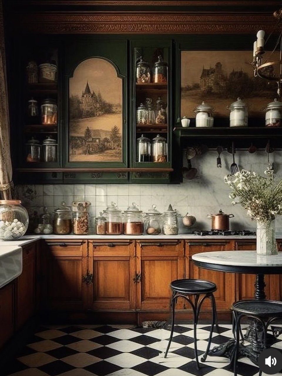
Black and white tiles laid in a checkerboard grid bring the formality and graphic punch of old European kitchens, entryways, and cafés.
The pattern works at any scale, from large squares to smaller mosaics, and the high contrast reads clearly even in low light.
Ceramic or porcelain tiles hold up well in high-traffic areas and offer a range of price points depending on finish and grade.
The grid needs clean grout lines to stay sharp, so plan for regular sealing if you use white grout.
This floor suits rooms where you want a strong focal point underfoot. It pairs well with plain walls and simple cabinetry that let the pattern lead.
8. Simple and Functional Design
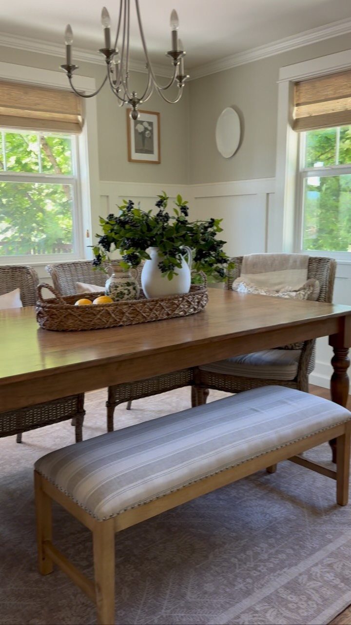
Furniture chosen for use rather than show keeps a room functional and uncluttered, the way European farmhouses and cottages have always worked.
A sturdy table, seating that pulls in when not needed, and pieces that store or serve a clear purpose leave the floor open and the space breathable.
The restraint comes from editing, not from buying less upfront.
Pick solid wood over veneers, natural fibers over synthetics, and forms that wear well. A woven bench or a caned chair ages visibly and still looks right years later.
The result feels lived-in without reading as spare.
Having this mix of style and eras through your decor ensures your space feels influenced by European design rather than an imitation, especially if you’re introducing the style into a home that isn’t in Europe.
9. High Ceiling with Exposed Beams
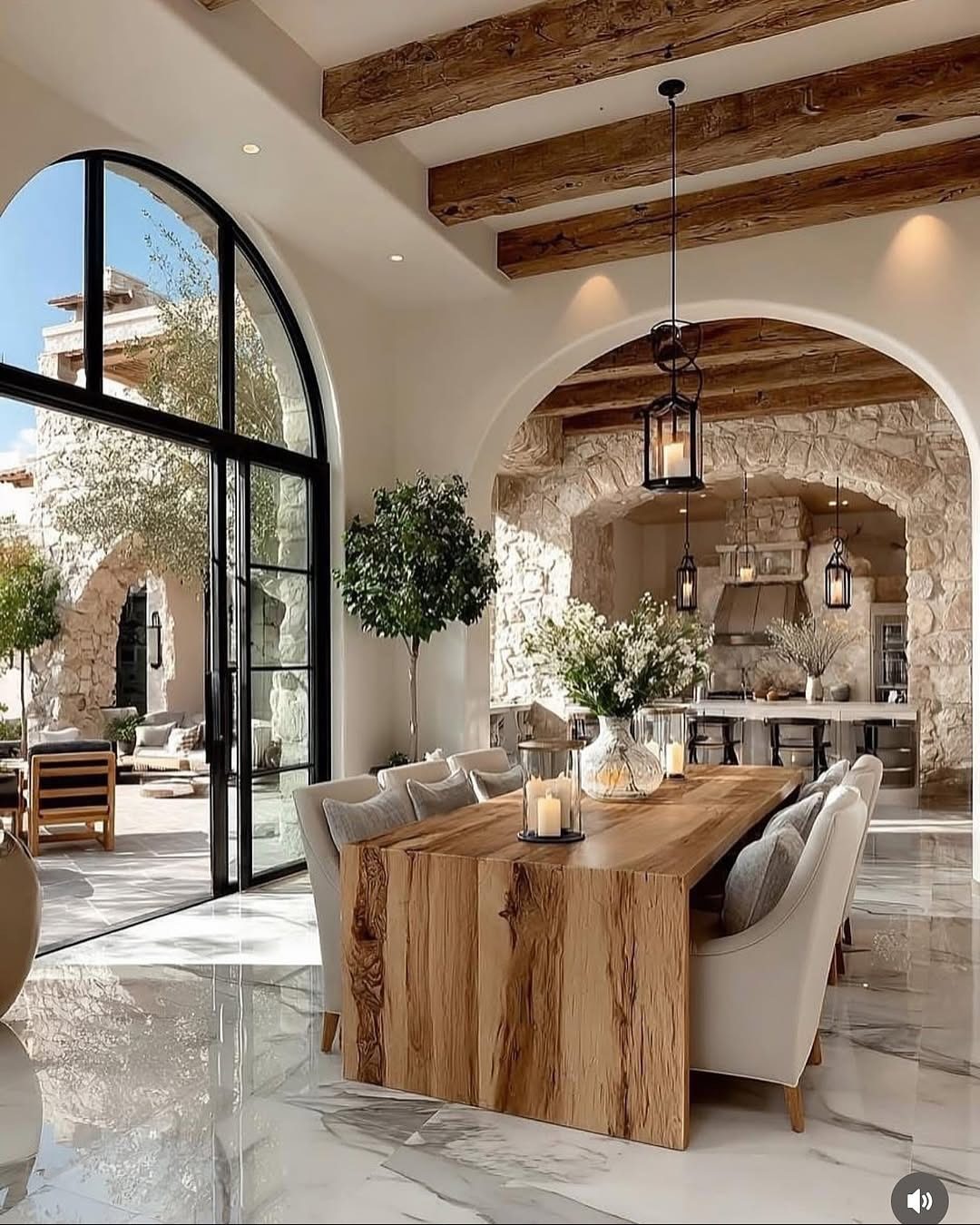
Vertical space and visible structure give a room the scale and presence of old European villas and converted barns. High ceilings open the volume, and wooden beams left exposed overhead anchor the height with texture and warmth.
Original beams are rare outside historic homes, but reclaimed lumber or new beams installed as false structural elements deliver the same effect. Stain them dark for contrast against white plaster, or leave them natural to match wood floors and furniture.
The look works best in open-plan spaces where the ceiling plane stays uninterrupted. Lower ceilings lose the vertical drama.
10. Vintage Furniture
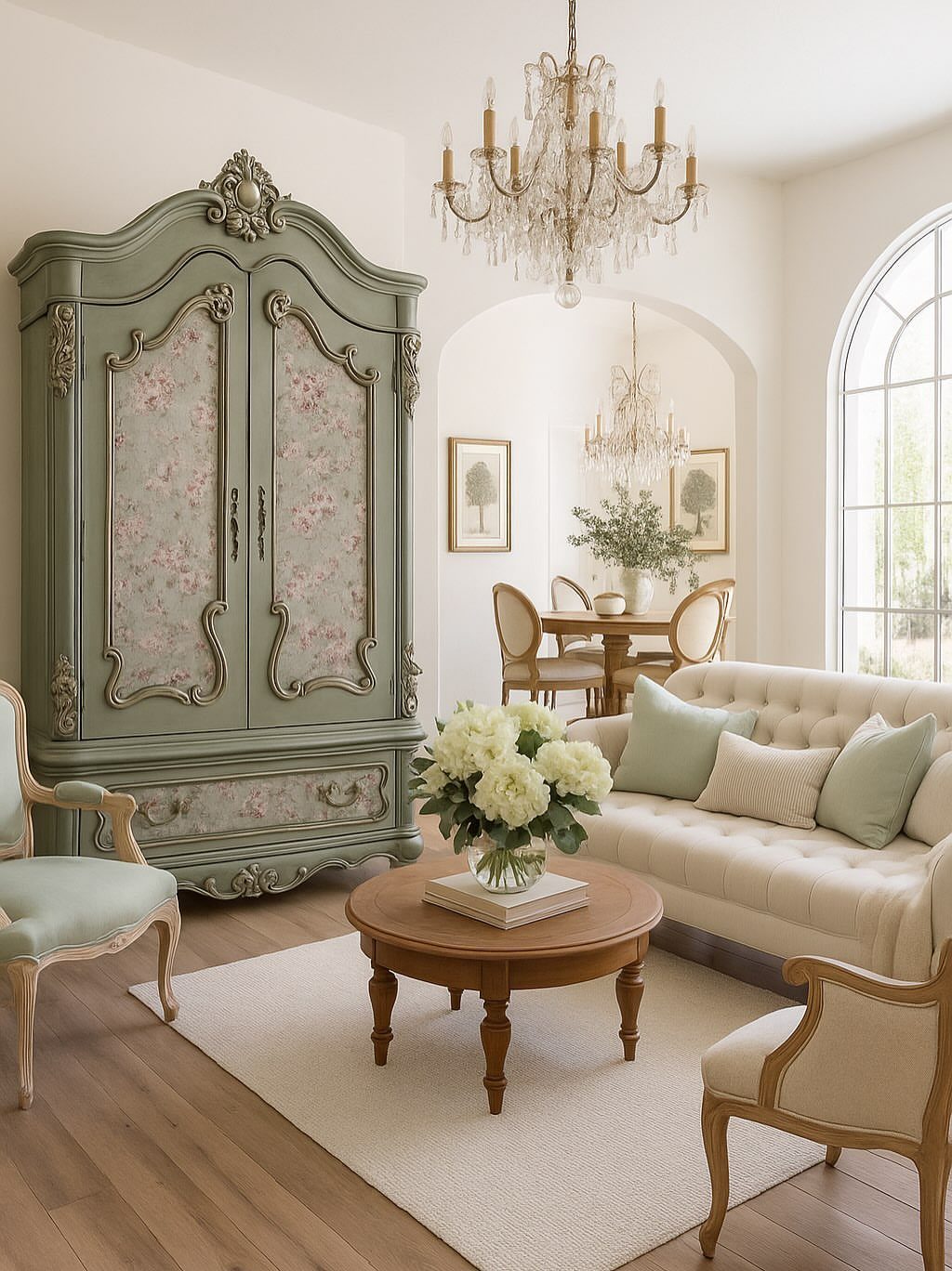
Older cabinets, tables, and seating bring joinery, proportion, and wear that new production rarely matches. Solid wood construction, hand-carved details, and finishes that show use over decades give a room depth and a sense of history that assembled furniture cannot.
Antique stores, estate sales, and online marketplaces are the usual sources.
Look for pieces with intact joinery and original hardware. Refinishing is optional; patina and minor damage often add character rather than detract from it.
Mixing vintage pieces with contemporary upholstery or neutral surroundings keeps the room from reading as a period display.
11. Distressed Chalk-Painted Furniture
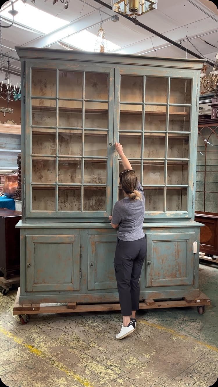
Chalk paint and sanding give furniture a worn, layered finish that mimics decades of use and repainting. The paint dries matte and chalky, and distressing the edges and high points afterward exposes raw wood or an underlayer of color.
Apply 2 coats, let them cure, then sand corners, drawer edges, and raised details with 120-grit paper.
Seal with wax or a matte topcoat to protect the surface. The finish works on wood, laminate, or previously painted pieces.
Pick soft blues, grays, or cream for a French or Scandinavian feel. The technique suits dressers, cabinets, and dining chairs better than upholstered pieces.
12. Dark Wax on Painted Wood
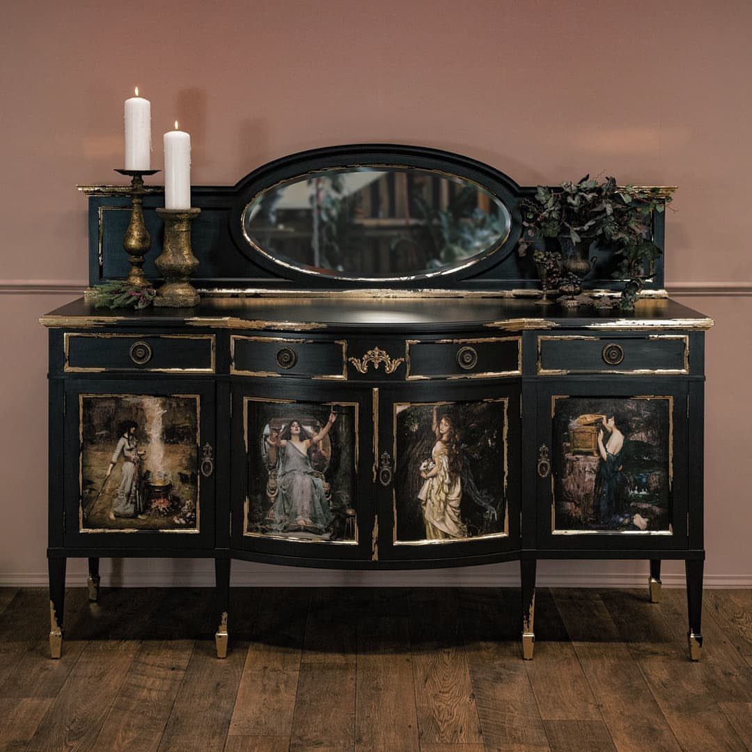
Dark wax brushed over painted wood settles into grain, corners, and carved details to mimic age and use. The wax darkens recesses while leaving flat surfaces lighter, giving the piece dimension and a hand-rubbed patina.
Apply it after the paint has cured.
Brush the wax on liberally, let it sit until it begins to haze, then buff off the excess with a clean cloth. The longer you wait before buffing, the deeper the tone.
This works best on pieces with texture or detail where the wax has something to catch. Flat surfaces show less effect and may look muddy if over-applied.
13. Tapestry Patterns
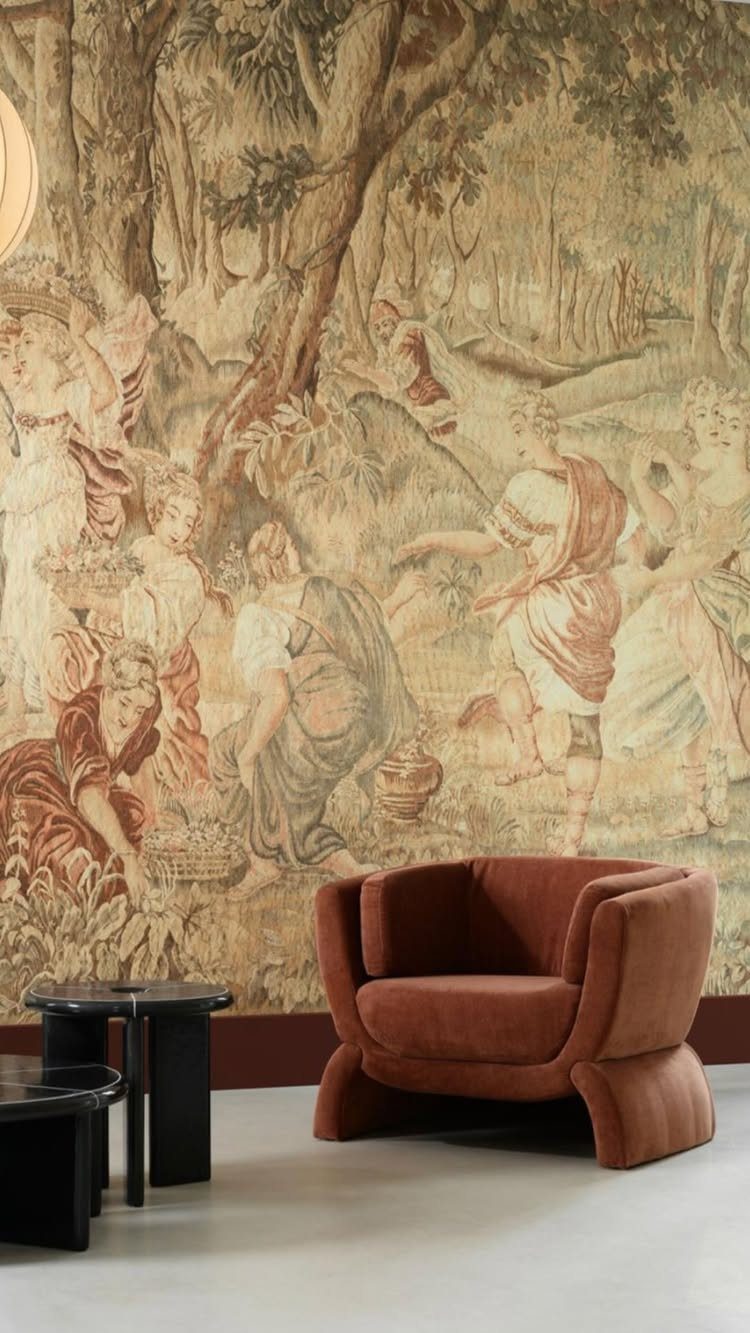
Woven tapestries hung as wall art bring pattern, texture, and a sense of old European formality into a room. The fabric softens sound and adds warmth in a way framed prints cannot.
Look for pieces with classical scenes, landscapes, or botanical motifs.
Hang a large one on a rod where you want the eye to go, or fit smaller pieces into a gallery wall. The weave shows age and craftsmanship that flat textiles lack.
This works best on a plain wall where the detail can register. Pair it with simple furniture to keep the room from feeling busy.
14. Velvet Upholstery
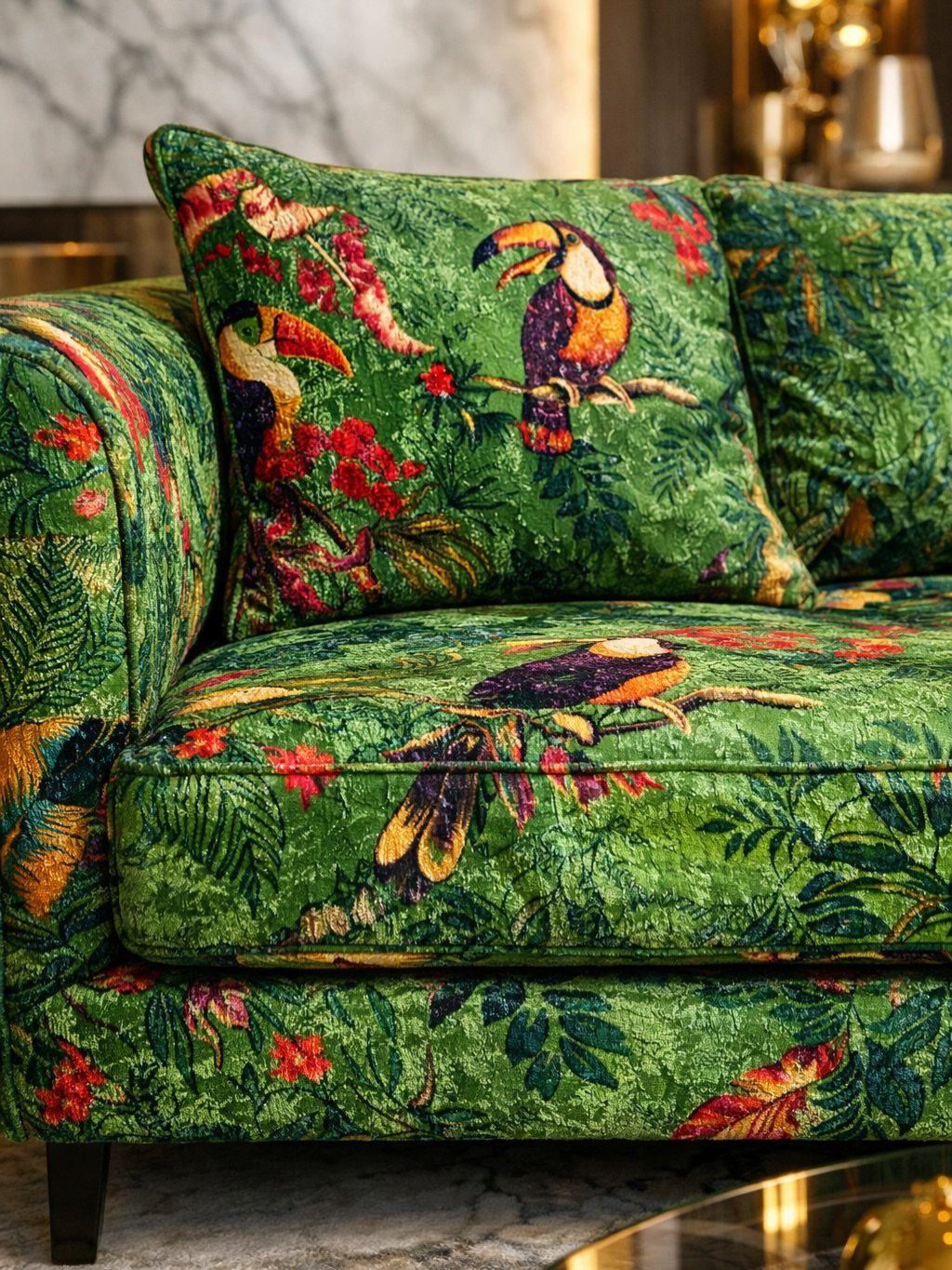
Velvet holds light and shadow across its nap, giving upholstery depth and a soft hand that reads as luxurious without feeling precious.
The texture suits sofas, chairs, and cushions in rooms where you want a tactile surface that still looks tailored.
Jewel tones like emerald, sapphire, or deep rust bring the richest effect, though softer tones work in lighter spaces. The fabric marks when brushed, so it shows use, but that lived-in quality fits European interiors better than something pristine.
Clean spills quickly and vacuum regularly to keep the pile from matting.
15. Leather Upholstery
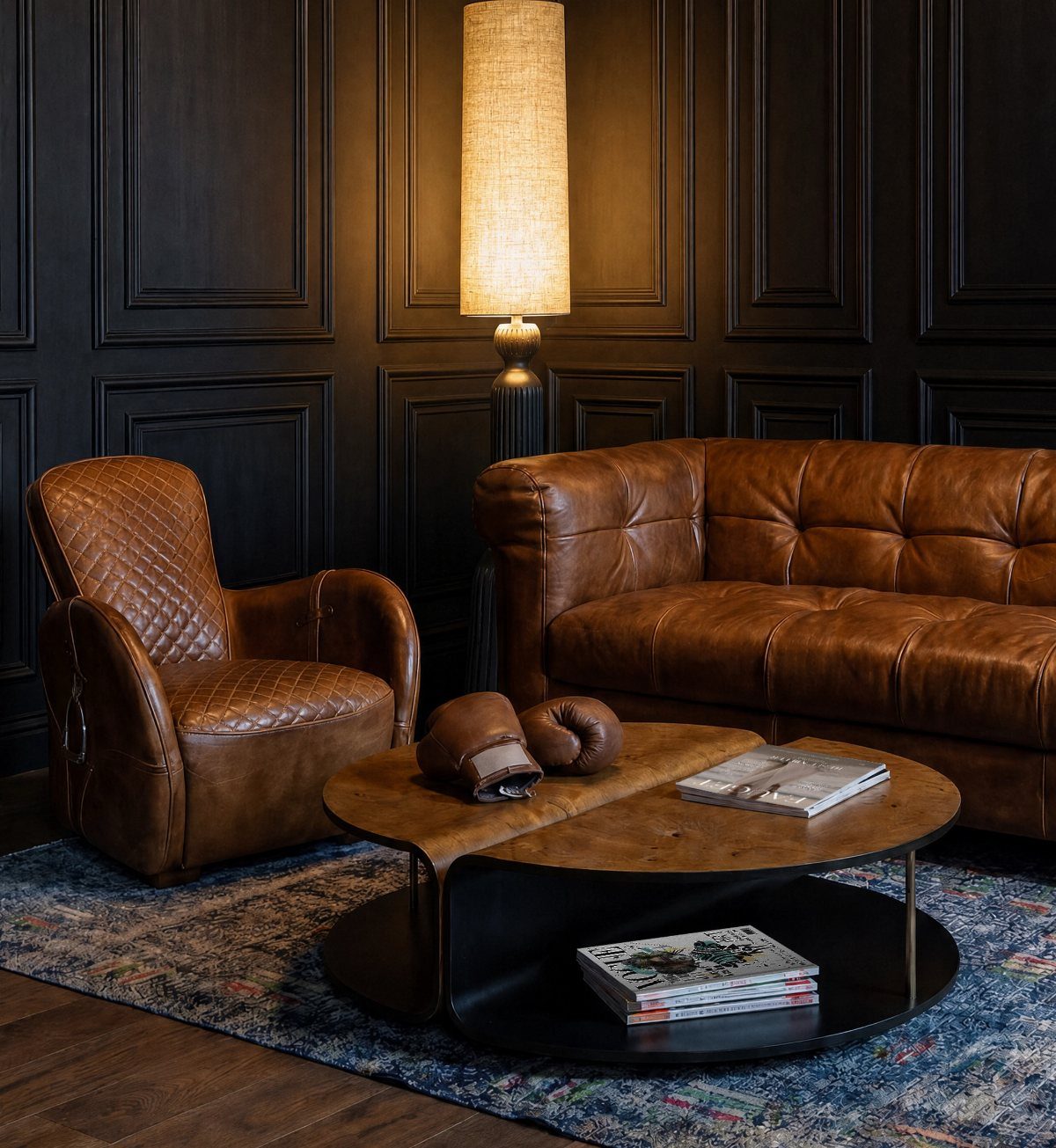
Leather ages visibly and improves with use, making it a practical choice for seating that needs to last. Tufted sofas and armchairs in brown, cognac, or black bring weight and warmth without requiring much care beyond occasional conditioning.
Full-grain leather shows the hide’s natural grain and develops a patina over time.
Top-grain finishes wear more evenly but lack the same character. Either suits high-traffic rooms better than fabric.
The material pairs well with wood, metal, and stone. It holds up in families and spaces where fabric would stain or wear through quickly.
16. Aubusson Rugs
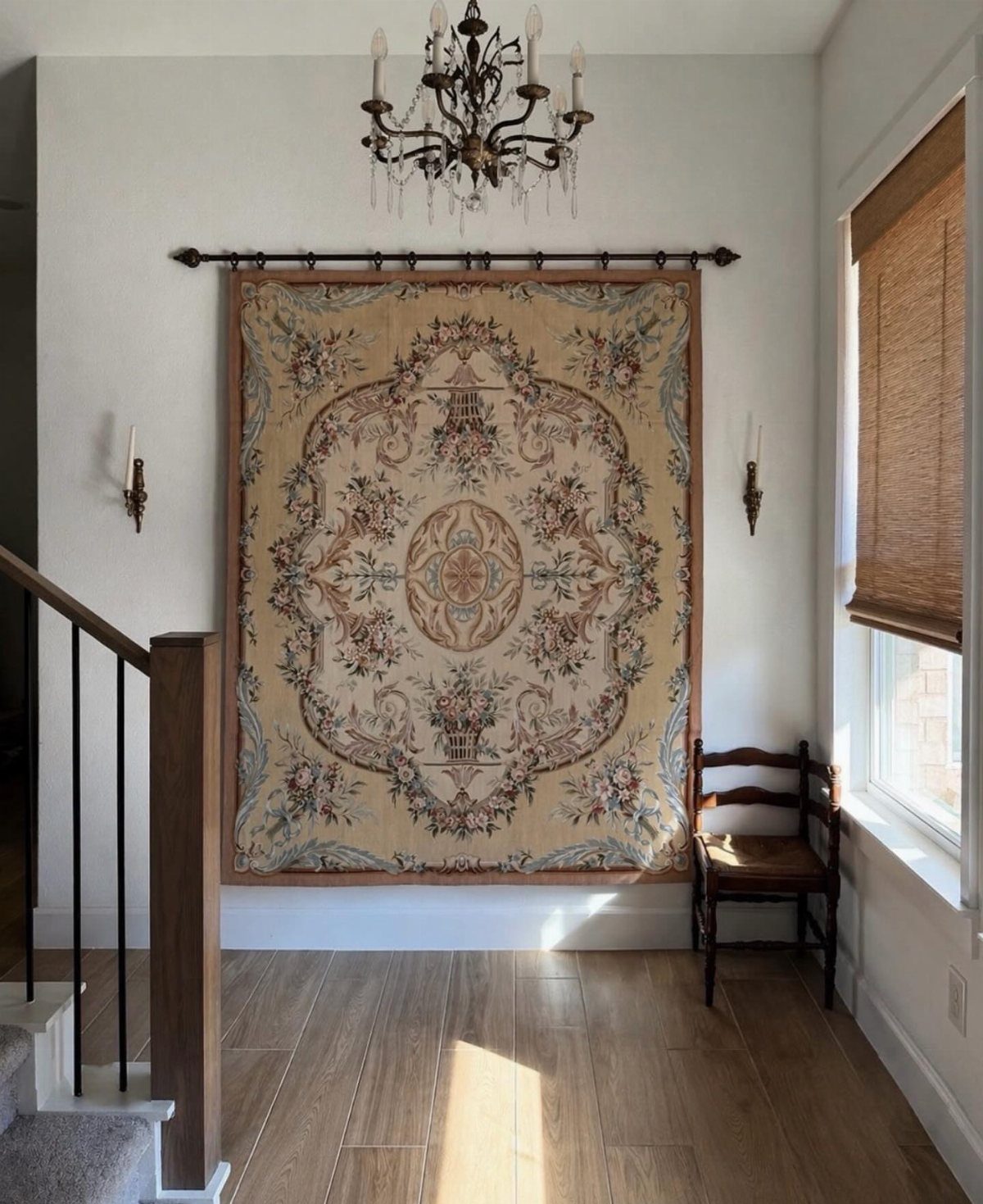
Aubusson rugs, traditionally woven in France with floral or pastoral motifs, bring color and pattern to a floor or wall. The flat weave lies low and shows intricate detail, and the muted palette suits formal and casual rooms alike.
Hang one on a rod or mount to show the full pattern, or layer it over sisal or jute for added texture and a defined border. Vintage examples show wear and fading that add character rather than diminish value.
This works best in rooms with plain walls and simple furniture where the rug can anchor the space without competing for attention.
17. French Country
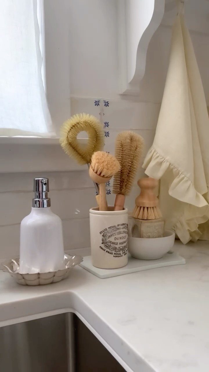
French country interiors mix rustic materials like raw linen, distressed wood, and worn stone with delicate details such as ruffled edges, turned legs, and carved hardware. The combination feels refined without formality, and the pieces look collected rather than matched.
Neutral tones dominate, with cream, soft gray, and weathered wood as the base.
Pottery, ironwork, and woven baskets bring texture and function. Open shelving, farmhouse sinks, and caned chairs reinforce the village-inspired feeling.
The look suits kitchens, dining rooms, and bedrooms where you want warmth and a relaxed, lived-in quality.
18. Modern German Design
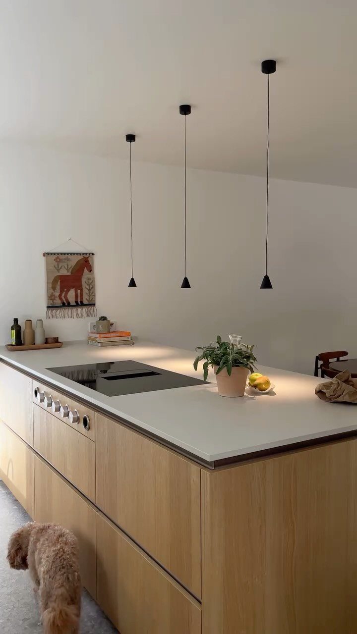
German modernism prioritizes function, clean geometry, and restrained materials. Flat-panel cabinetry, handleless doors, and cantilevered forms keep lines unbroken, and the palette stays neutral with white, gray, and natural wood as the foundation.
Built-in storage, engineered wood, and metal fixtures deliver precision without ornament. The approach suits open-plan kitchens and living spaces where clarity and efficiency matter more than decoration.
Pair minimalist furniture with practical lighting and durable surfaces. The restraint reads as calm rather than cold when natural light and wood tones soften the space.
19. Spanish Revival
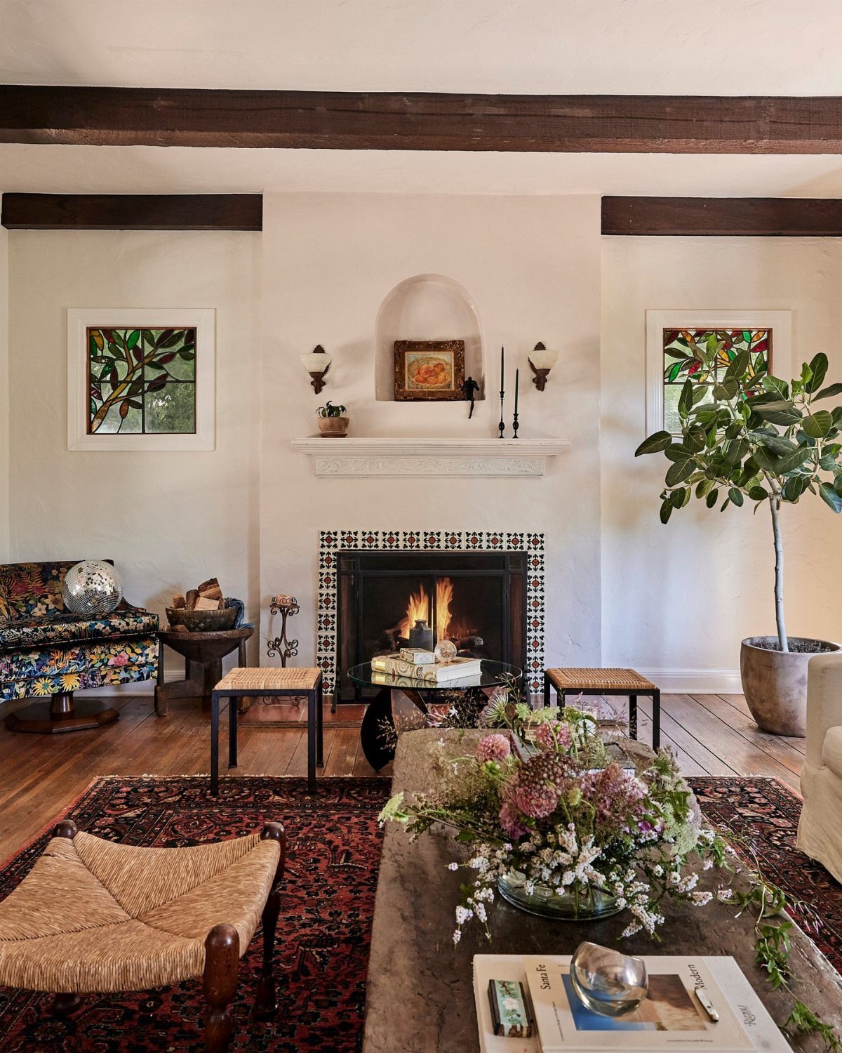
Terracotta tile, plaster walls in warm cream or ochre, and exposed wood beams overhead bring the weight and texture of Spanish colonial architecture into a living room or entry.
The palette stays earthy, with rust, sand, and deep brown anchoring the space.
Wrought iron hardware, leather seating, and hand-carved wood furniture add the rustic detail that keeps the room from reading as minimal. Pottery, woven textiles, and thick plaster walls reinforce the handcrafted quality.
The look suits rooms with high ceilings and natural light. Darker beams contrast well against lighter walls, and tiled floors hold up in high-traffic areas where wood might scratch.
20. Arched Openings
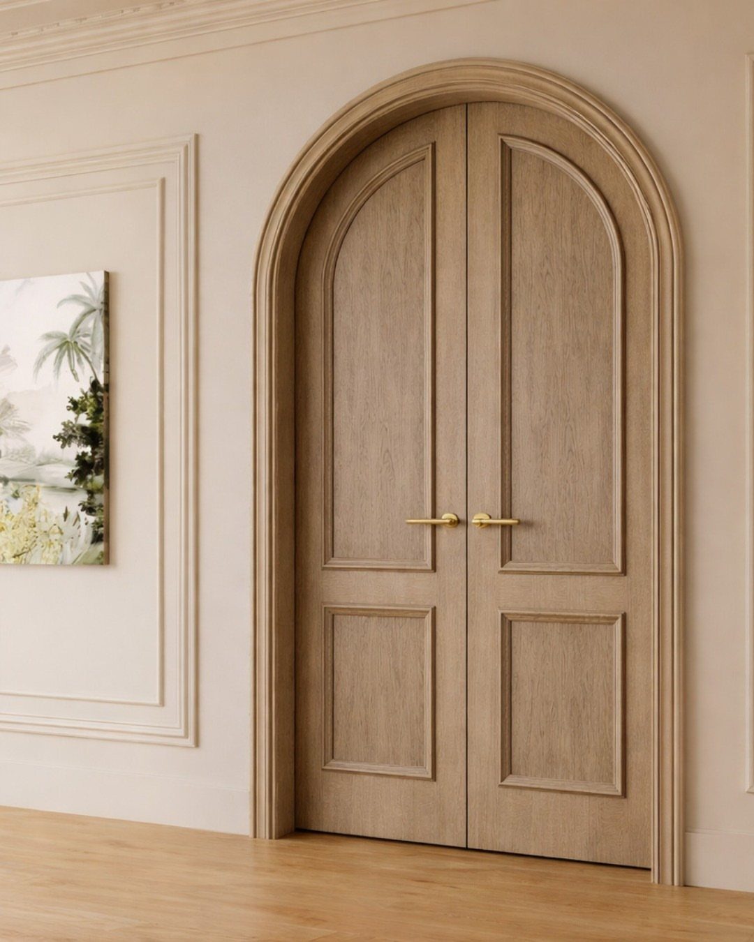
An arched doorway or window opening softens a room’s geometry and adds architectural presence without ornament. The curve can be a full semicircle or a gentler segmental arc, depending on the height of the opening and the wall thickness.
Existing rectangular openings can be retrofitted with an arched transom or a false arch applied to the drywall. New construction allows for true structural arches in brick, stone, or plaster.
The form suits formal entries, hallways, and rooms where you want to guide the eye upward. Painted the same color as the wall, the arch reads as part of the architecture rather than applied trim.
21. Parquet Flooring
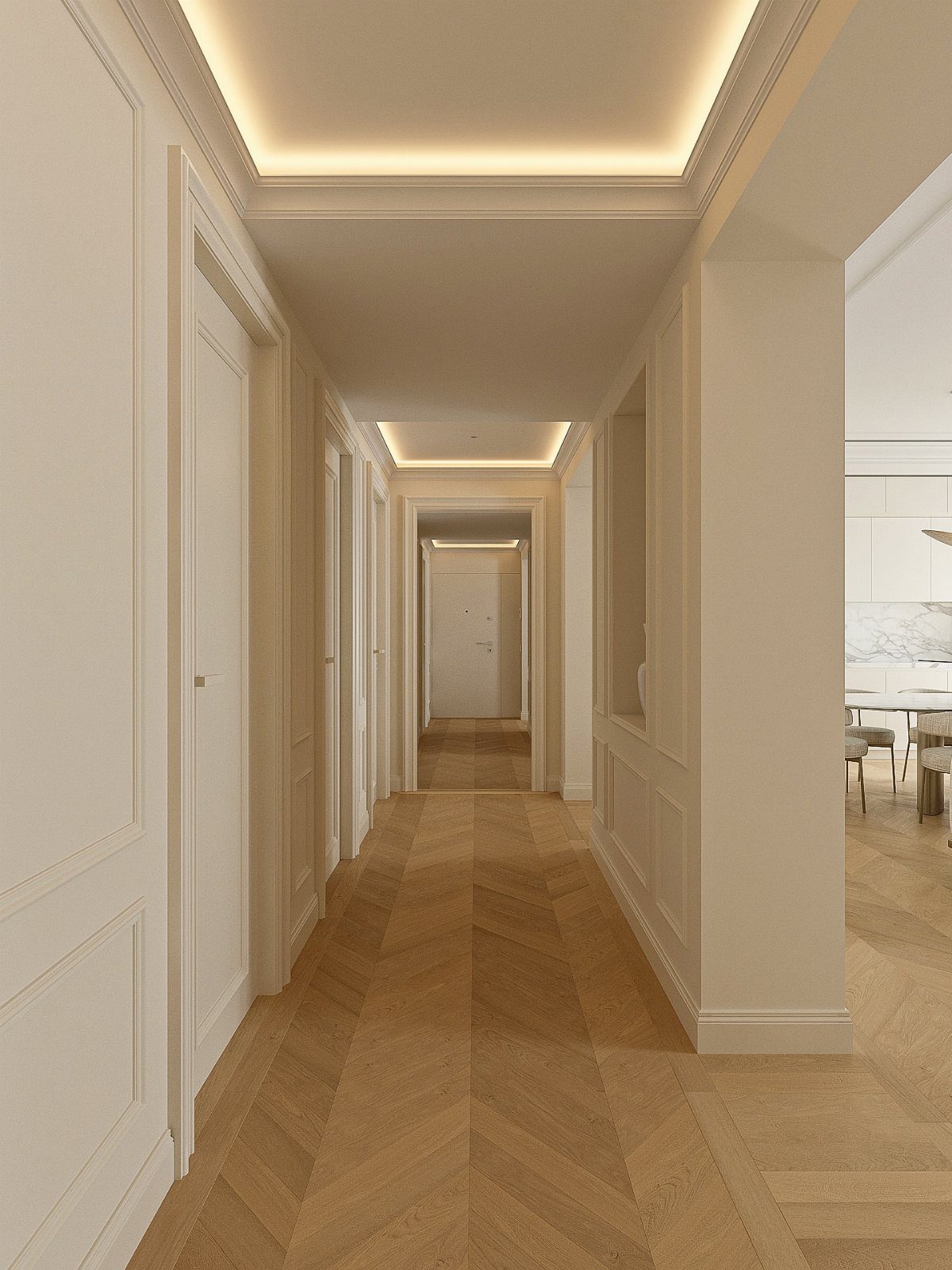
Parquet laid in chevron or herringbone patterns brings geometric order and visible craftsmanship to a floor. Individual planks or blocks are set at an angle, creating a continuous zigzag that catches light differently than straight-laid wood.
Oak and walnut are common choices. Prefinished parquet comes in interlocking tiles for easier installation, though site-finished strips allow for tighter joints and custom staining.
Refinishing worn parquet restores the pattern and evens out color variation. The detail suits rooms with plain walls where the floor can carry the visual interest.
22. Vintage Rugs
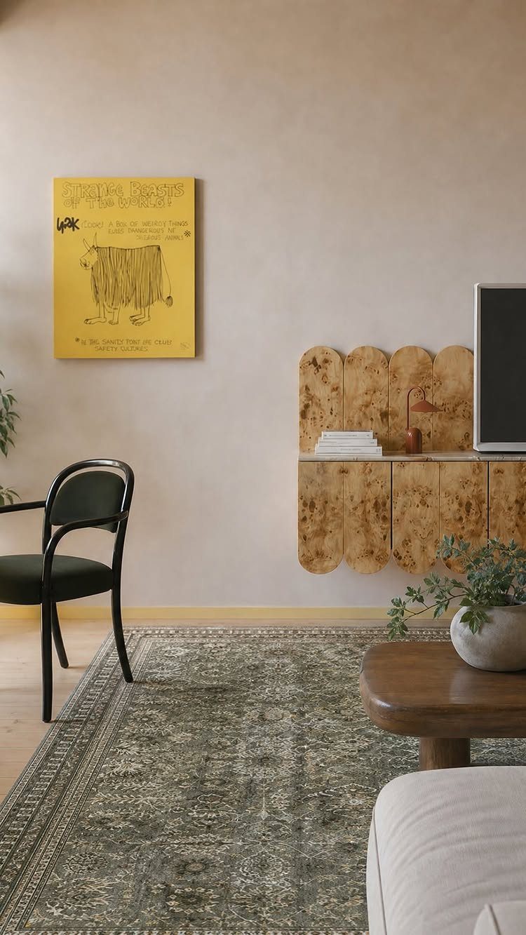
A rug worn thin in places, with faded dye and an uneven border, brings age and texture that new reproductions cannot match.
Persian, Turkish, and Moroccan examples show intricate knotwork and motifs that hold up even when the pile has compressed.
Look for structural integrity over pristine condition.
Fraying edges can be bound, and stains often settle into the weave as part of the patina. The muted colors that come from decades of fading pair well with neutral furniture and plain walls.
Layer a vintage rug over jute or sisal to define a seating area, or center it under a dining table where the pattern can frame the space.
23. Fireplaces
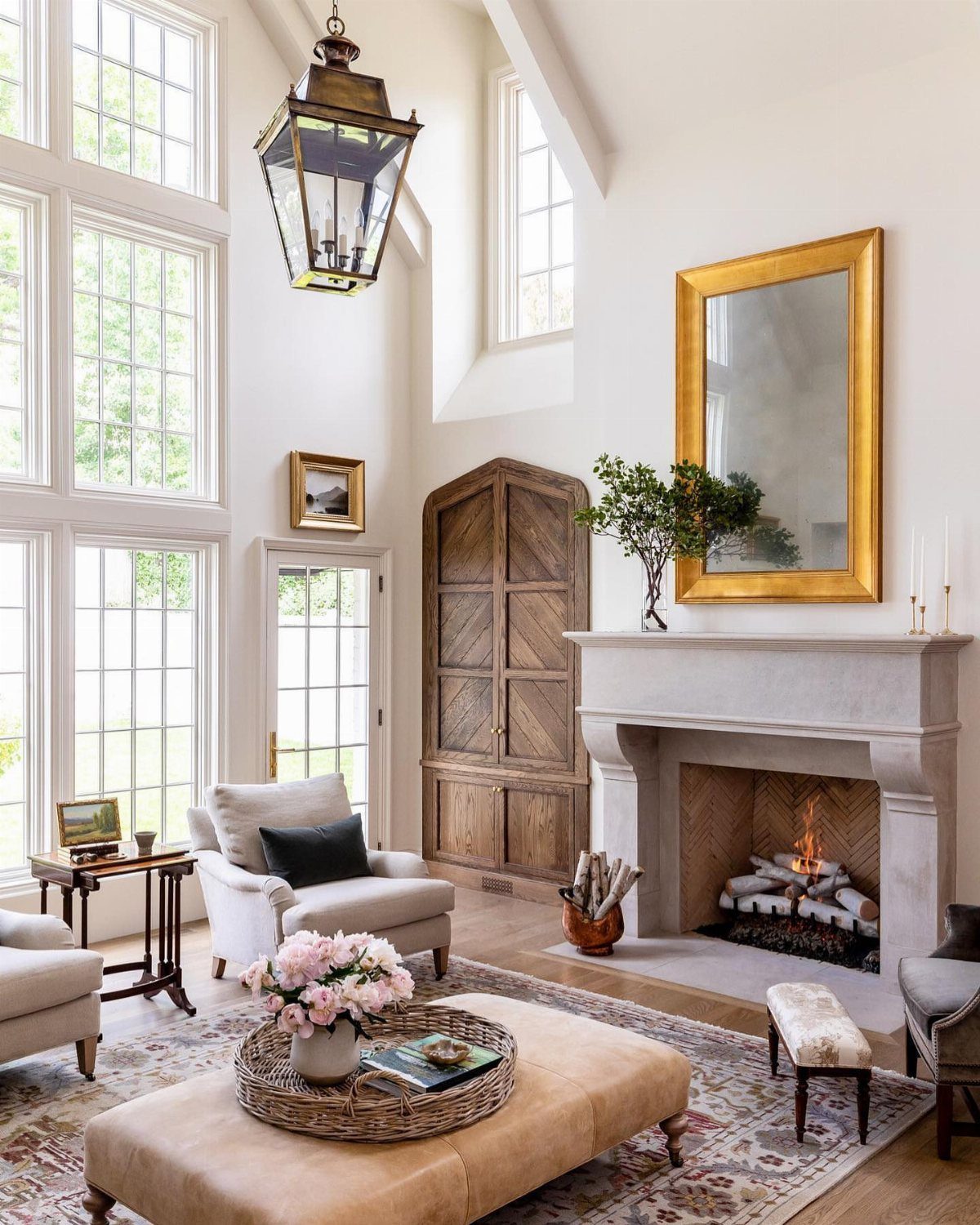
A working fireplace anchors a room with heat, light, and a focal point that furniture arranges around naturally. Wood-burning models require a chimney and regular maintenance, while gas inserts offer convenience with less upkeep.
Surround the firebox with stone, brick, or plaster to tie the hearth into the architecture.
A raised hearth provides seating and defines the fireplace as a structure rather than just an appliance. Keep the mantel simple or omit it entirely to let the materials speak.
The presence of a fire changes how a room is used. Seating shifts toward the hearth, and the vertical plane above it becomes a natural place for a mirror or art.
24. Gold Accents
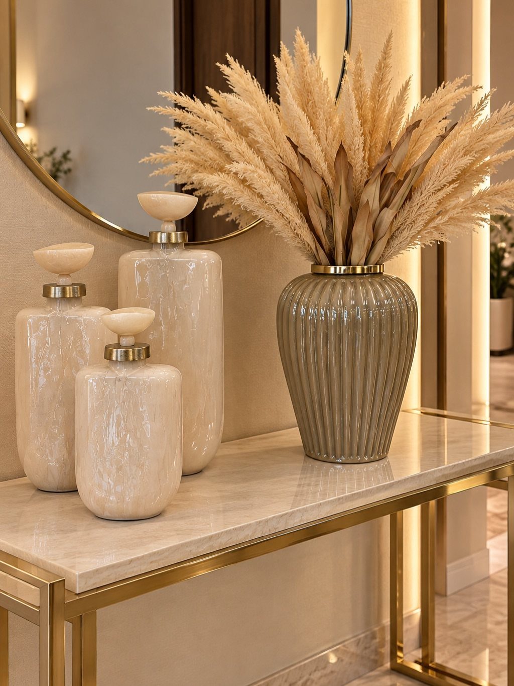
Brass or gold-finished hardware, mirror frames, and lighting fixtures bring warmth and formality into a neutral room. The metallic catches light and contrasts with stone, wood, and painted surfaces without requiring much material.
Use it sparingly.
A gold-framed mirror over a console, cabinet pulls in brushed brass, or a single chandelier adds the effect without overwhelming the space. Polished finishes read as more formal, while brushed or aged gold fits rustic and transitional interiors.
The tone pairs well with marble, cream walls, and dark wood. Too much gold competes with itself, so pick a few pieces and let them stand out.
25. Moody Interiors
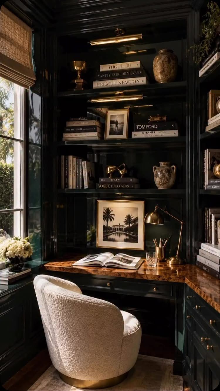
Dark walls in charcoal, forest green, or navy create a grounded, intimate atmosphere when paired with sufficient lighting.
The color absorbs light rather than reflects it, so the room needs multiple sources: a desk lamp, overhead fixture, and natural light from a window.
The approach works in home offices, libraries, and bedrooms where you want the space to feel enclosed rather than open. Dark green built-ins and walls like these can anchor a moody interior without feeling heavy when the proportions stay balanced.
Paint built-ins the same color as the walls to make them recede, or contrast them with wood to add warmth. Lighter furniture and textiles prevent the room from feeling too closed in.
26. Modern European Classic Interior
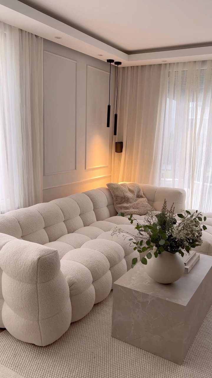
Classical architecture meets contemporary furniture when plain white upholstery and minimal forms sit inside rooms with crown molding, tall baseboards, and paneled walls. The restraint in the furniture lets the architecture register without competition.
Neutral tones throughout keep the focus on shape and proportion rather than pattern or color. Stone and marble add weight without ornament, and sheer curtains soften the light without blocking it.
This suits apartments and homes where the bones are formal but the living needs to feel current. The balance works when each side stays quiet enough to let the other breathe.
27. European-style Balcony Garden
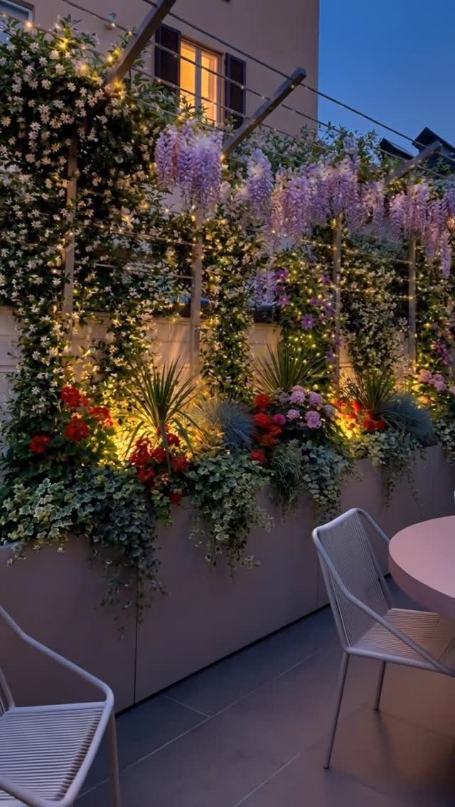
Climbing vines trained up a balcony rail or wall, potted flowers in clusters, and string lights overhead turn a narrow outdoor space into a layered garden.
Wisteria and jasmine add height and fragrance, while lower planters in terracotta or ceramic bring color at eye level.
A small bistro table and 2 chairs fit most balconies and create a place to sit that feels separate from the interior. Water the plants regularly, and prune climbers to keep them from overtaking the rail or blocking the door.
The setup suits renters and homeowners with limited outdoor space. The contained scale makes maintenance manageable without needing a yard.
28. Natural Stone Flooring
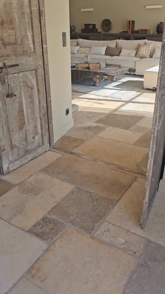
Limestone, travertine, and slate bring durability and a worn, natural look that synthetic tile cannot replicate. The color variation between pieces adds texture, and the cool surface stays comfortable underfoot in warm climates.
Stone tiles come in standard sizes or irregular cuts that fit together like a puzzle.
Honed finishes feel smoother and show less wear than polished, while tumbled edges soften the geometry. Seal the stone after installation to resist stains and moisture.
The material suits entries, kitchens, and living areas where you want flooring that improves with age. It pairs well with wood furniture and neutral walls.
29. Formal Green Garden
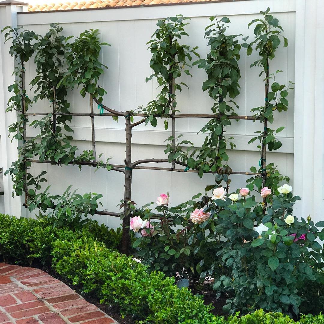
Shaped hedges, espaliered fruit trees, and symmetrical beds with brick or gravel paths bring structure and formality to a front yard or courtyard. The greenery stays clipped and controlled, with boxwood, yew, or privet as the backbone.
Espalier training flattens a tree against a wall or fence by tying branches to wires in horizontal tiers.
Prune in late winter to maintain the pattern. Low hedges define beds and frame roses, lavender, or other flowering plants.
The look suits homes where the architecture is formal and the garden extends that order outdoors. Regular trimming keeps the shapes tight and the beds tidy.
30. Neutral Open-plan Interior
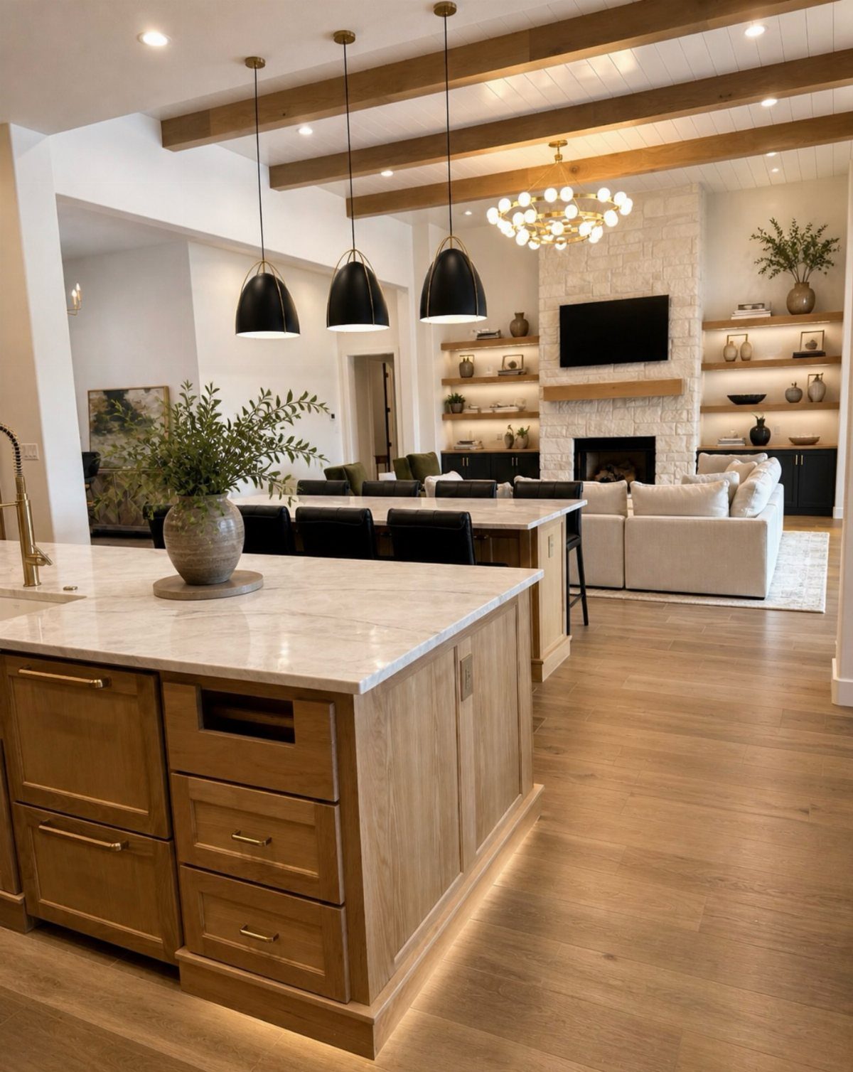
Exposed ceiling beams, stone fireplace surrounds, and natural materials anchor an open kitchen and living area while contemporary cabinetry and clean-lined furniture keep the space from reading as rustic.
The contrast between old and new gives the room weight without closing it off.
A marble or stone island defines the kitchen boundary without a wall, and pendant lights mark the transition overhead. Neutral upholstery and minimal decor let the architectural elements carry the visual interest.
This works in new builds or renovations where you want an open layout with character. The beams and stone add presence, and the open plan keeps the flow intact.
31. Ornate Classical Living Room
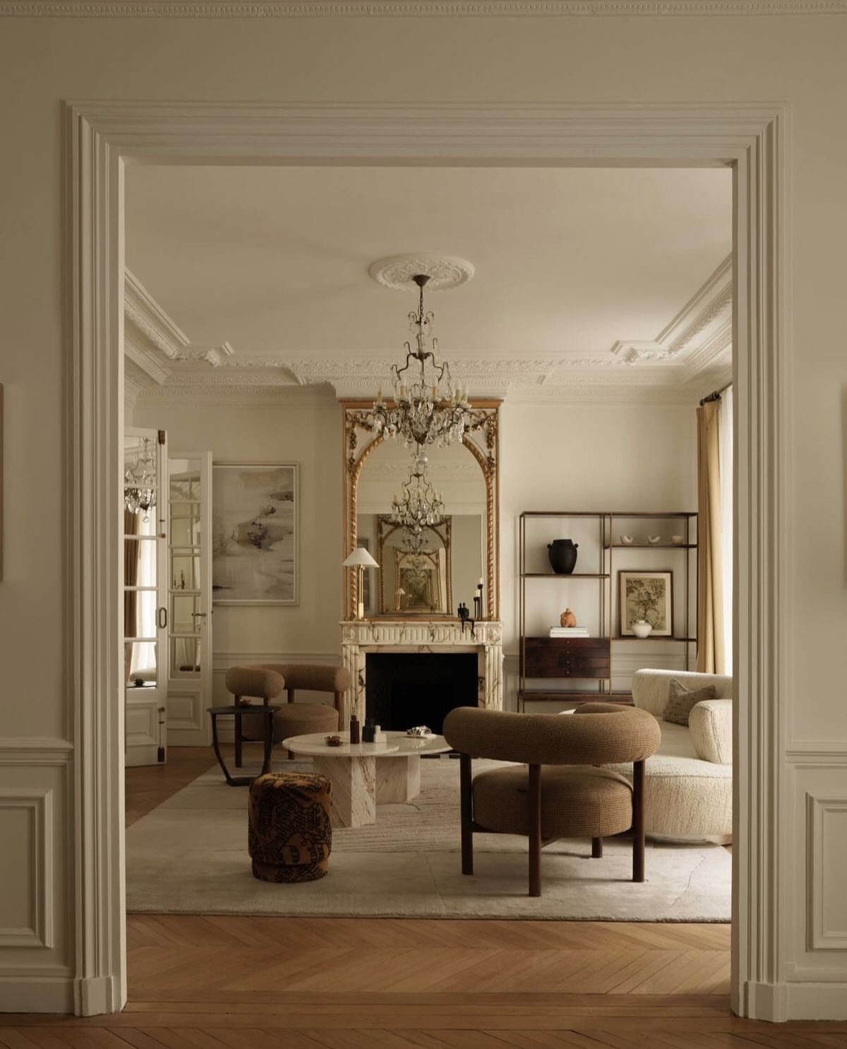
A chandelier centered overhead, a carved gold mirror above the mantel, and herringbone flooring give this room the weight of formal European interiors. Marble frames the fireplace, and ceiling moldings define the perimeter.
The neutral palette keeps the ornament from feeling heavy. Beige upholstery and light walls let the architectural details and metallic accents carry the formality without competing for attention.
This suits rooms with high ceilings where you want the space to feel dressed without adding color or pattern.
32. Collected European Kitchen
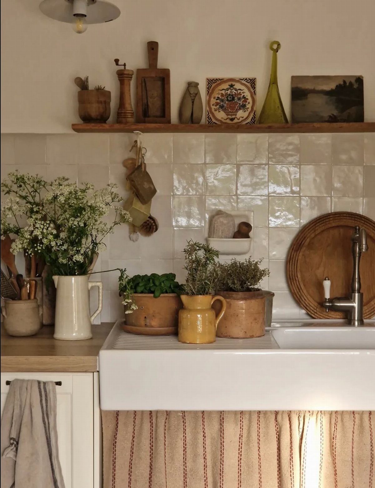
A farmhouse sink drops into the counter below white subway tile, and a narrow wooden shelf mounted above holds pottery, a small framed painting, and a pitcher of flowers.
The shelf keeps everyday objects visible and brings texture to the wall without upper cabinets.
Choose pottery in neutral tones or simple glazes that layer well. Rotate what sits on the shelf seasonally, swapping flowers for branches or adjusting the arrangement as pieces accumulate.
This works in kitchens where you want storage and display combined, and it suits renters who cannot install permanent cabinetry.
33. Sage Green Kitchen
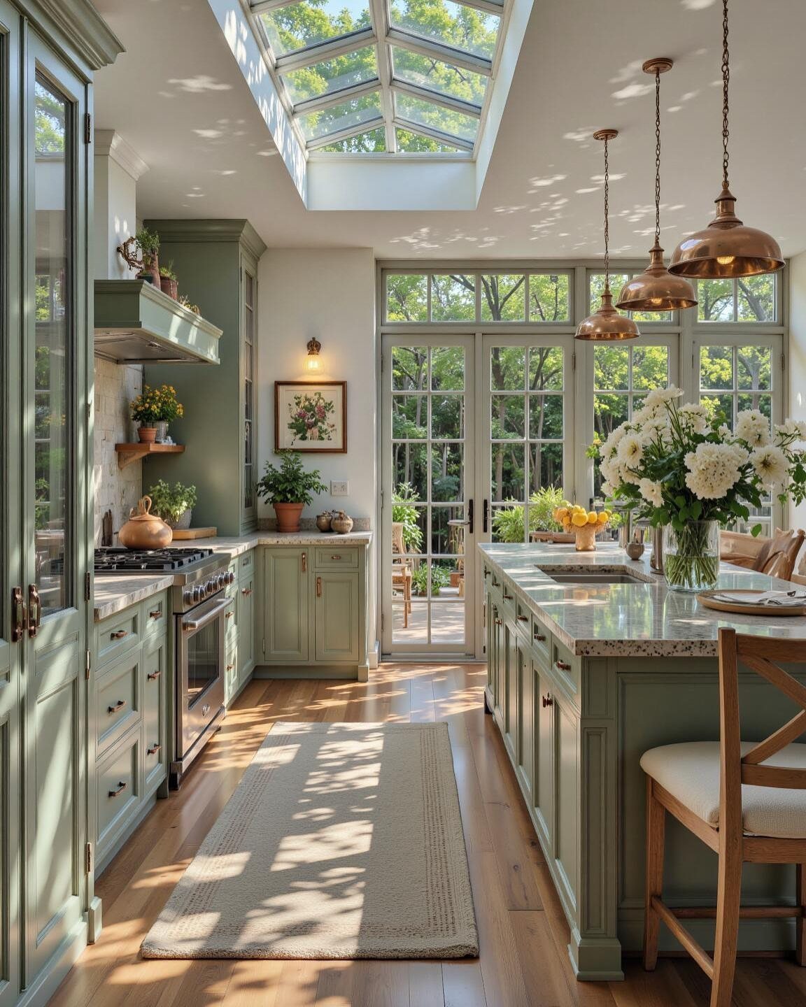
Sage cabinetry paired with a marble island and copper pendant lights gives a kitchen the softness of European country design while keeping the palette restrained.
The greenish-gray reads as neutral but warmer than white, and the copper adds warmth without bright color.
Natural light from a skylight or large windows keeps the green from darkening the space. Pair it with light wood floors and white or cream walls to maintain brightness.
Sage suits kitchens where you want color that feels grounded rather than bold. It pairs well with natural materials and brass or copper hardware.
34. Curved Wood Dining Chairs
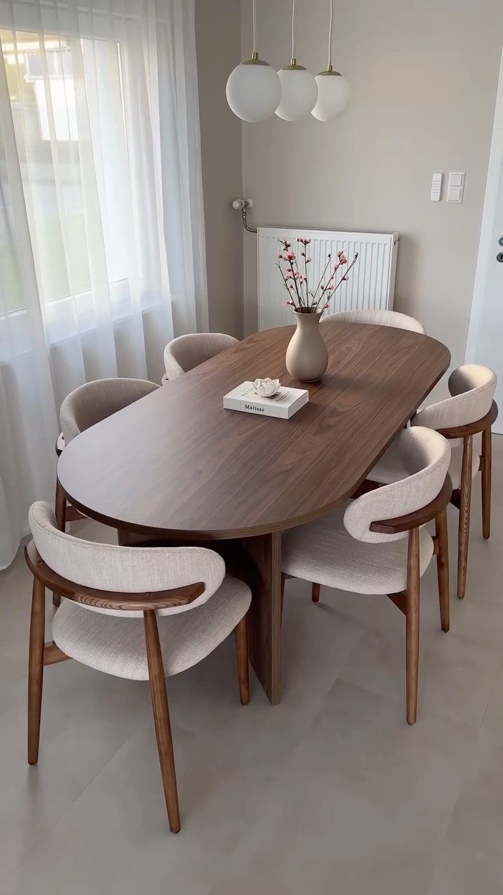
Upholstered seats in cream fabric meet curved wooden arms and legs in a medium to dark stain, creating chairs that feel formal but comfortable around an oval dining table.
The wood curves soften the geometry and add handcrafted detail without carving or ornament.
Look for chairs with a supportive back height and proportions that fit your table. The curved arms take up more space than armless chairs, so measure the clearance if the table sits in a tight dining area.
Cream fabric shows wear but cleans with upholstery cleaner. Consider a performance fabric if the chairs get daily use.
35. Ornate Bedroom Details
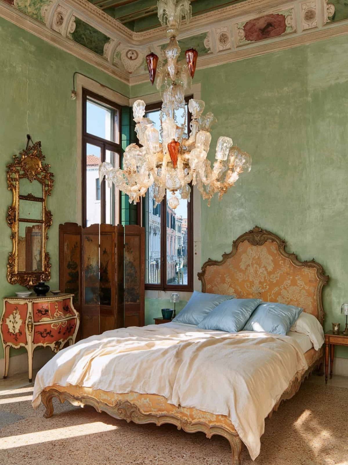
Gold leaf on a carved bedframe, an elaborate glass chandelier, and a painted ceiling turn a bedroom into a formal interior with layered ornament.
The bed and chandelier anchor the room, while the decorative commode and mirror add smaller points of gilding.
Light green walls soften the gold without competing with it. The painted ceiling extends the formality upward and makes the room feel taller.
This suits bedrooms in older homes where the architecture already leans formal, or in spaces where you want the room to feel intentionally dressed rather than minimal.
36. Decorative Plate Display
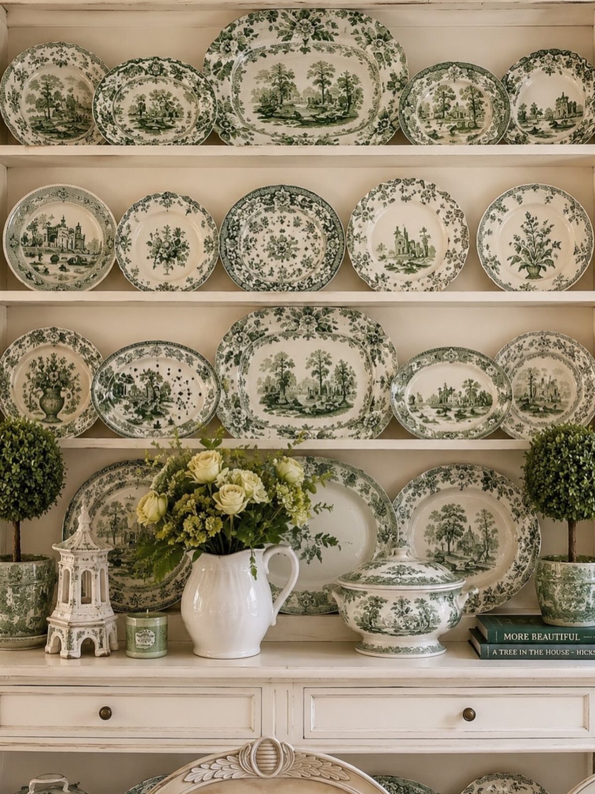
Green-and-white toile plates and serving bowls stand upright on open hutch shelves, arranged with a white pitcher, small boxwood topiaries, and a few books.
The repetition of the toile pattern creates cohesion, and the white shelves keep the display from feeling cluttered.
Group plates by size or pattern, and layer smaller pieces in front of larger ones.
This works in dining rooms or kitchens where you want dishware on display rather than hidden. It suits collected pieces that look better seen than stacked.
Make Rooms Feel Lived in
Personal items earn their place by use, not by following a style rule.
Books stacked on a side table, pottery collected over years, or a bowl that holds keys daily layer a room with the marks of someone actually living there.
Open shelving in a laundry room or kitchen turns storage into display when what sits on it gets used. Woven baskets, jars of staples, or folded linens look intentional because they serve a function first.
Heirlooms and pieces with history, whether inherited or found at a sale, bring age and texture that new furniture cannot match.
A worn rug, a side chair that saw decades of use, or hand-thrown pottery add depth without requiring a story attached.
Fresh greenery in a functional space, even a utility room, softens hard surfaces and signals that the room matters beyond its task.
Balance Form and Function
A room designed around how you use it outlasts one styled to look a certain way.
Seating height, table size, and lighting placement follow the tasks and hours the space needs to support, and the materials chosen hold up to that use.
Working with an architect or contractor early lets storage, layout, and built-ins align with daily routines rather than getting added afterward. Thoughtful palettes and minimalist arrangements keep a space calm without sacrificing what it needs to do.
Scale and balance matter when placing art and objects. The right size anchors a wall or surface; too small reads as an afterthought, too large crowds the room.
A home should feel true to the people in it, not fit a template.
Adapt the Style to Scale
Compact apartments handle European influences well when the palette stays neutral, storage goes vertical, and furniture serves more than one purpose.
A dining table that doubles as a desk or a bench with storage underneath keeps the floor open and the room flexible.
Minimalist layouts prevent a small space from reading as cluttered, and a restrained material palette, linen, wood, stone, ties the room together without adding visual weight.
Open-plan contemporary homes absorb modern European elements without structural changes. Clean lines, handleless cabinetry, and built-in storage layer easily into existing layouts, and neutral tones keep additions cohesive.
The principles adapt to the space rather than requiring it to fit a fixed scale.
Frequently Asked Questions
What are the main styles of European interior design?
French country, modern German design, and Spanish revival are the major regional styles.
French country mixes rustic linen and distressed wood with delicate carved details, German modernism favors flat-panel geometry and handleless cabinetry, and Spanish revival brings terracotta tile, plaster walls, and exposed beams.
Each style uses neutral tones and natural materials as its base.
What is the 3-5-7 rule in decorating?
The rule of three suggests grouping decor items in odd numbers, typically three, for a more collected and less formal arrangement.
This applies to styling shelves, arranging art, or placing objects on a surface where symmetry would feel too stiff. Odd groupings read as intentional without looking staged.
How to make your house look European?
Start with a neutral base of cream or white walls, add natural materials like linen and raw wood, and layer in 1 or 2 rich accent colors through textiles or pottery.
Hang a gallery wall salon-style, install architectural moldings, or lay a vintage rug over wood or jute. The look comes from editing and restraint rather than filling every surface.
What is European Style Interior Design?
European style pulls from French, Italian, Spanish, and German traditions, mixing detailed moldings, high ceilings, exposed beams, and natural materials like stone, wood, and linen.
Classic versions use checkerboard floors, parquet, and old-world art, while modern interpretations lean on clean geometry and muted palettes. The common thread is timeless materials and functional furniture that ages well.
What’s so different about classic European interior style design?
Classic European interiors prioritize consistency and symmetry, with timeless materials and furniture chosen for longevity rather than trend.
The look layers natural textures, neutral tones, and a few collected pieces rather than matched sets. Architectural details like moldings, beams, and arched openings carry the weight instead of relying on decor alone.
How can European interiors be adapted for small apartments?
Stick to a neutral palette, use vertical storage, and choose multifunctional furniture to keep the floor open.
A vintage mirror, one striking light fixture, or a single French chair brings the look in without filling every corner. Focus on materials and proportion rather than filling the room with pieces.