

Color reaches a room through paint, furniture, tile or accessories, and the right entry point depends on whether you rent, how much natural light you have, and what you already own.
If your walls stay neutral because you cannot paint or prefer flexibility, pillows and art let you test shades and swap them out.
If you own the space and want commitment, a sofa in velvet or cabinets in forest green anchor the palette in one move.
North-facing rooms need warmer tones to counter cool daylight, while south-facing spaces can handle blues and grays without feeling cold.
1. Neutral Base
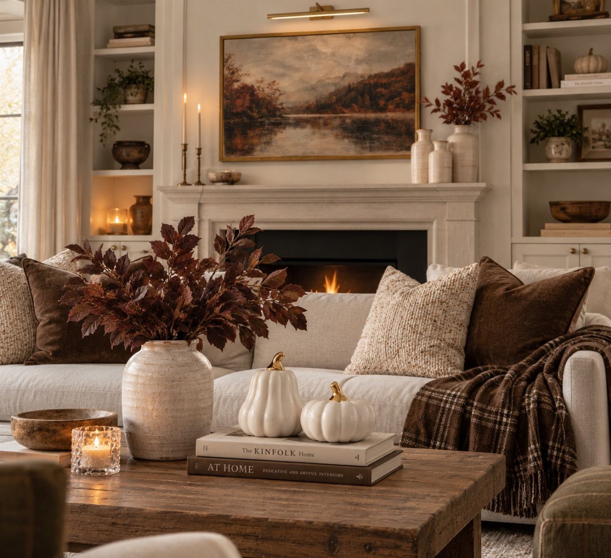
A neutral foundation gives you flexibility to change colors without repainting or replacing major pieces. Whites, beiges, tans and grays on walls and larger furniture let you shift the feel of a room by swapping pillows, throws or smaller accents.
This approach suits renters and anyone working with existing furniture. You keep what you have and adjust around it.
2. Add Colorful Accessories
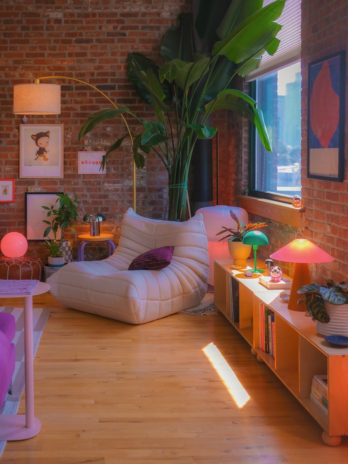
Pillows, lamps, vases and small decorative objects let you test color without commitment. If a shade feels wrong after a week, you move it to another room or return it.
I start with one or two accent colors and repeat them in at least three places so the room feels intentional rather than random.
A pink lamp, a pink pillow and a framed print with pink in it read as a choice.
This keeps cost low and lets you change direction with the seasons or whenever the mood shifts.
3. Natural Colors
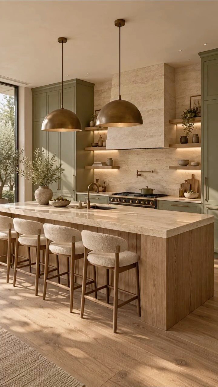
Sage greens, warm browns, soft terracottas and sandy beiges bring color into a space without feeling bold. These tones sit close to what you see outdoors, so they tend to feel calmer and easier to live with than brighter options.
I find they pair well with wood, stone and other natural materials, which makes them straightforward to layer into a kitchen or living room that already has those textures.
4. Add Colorful Art
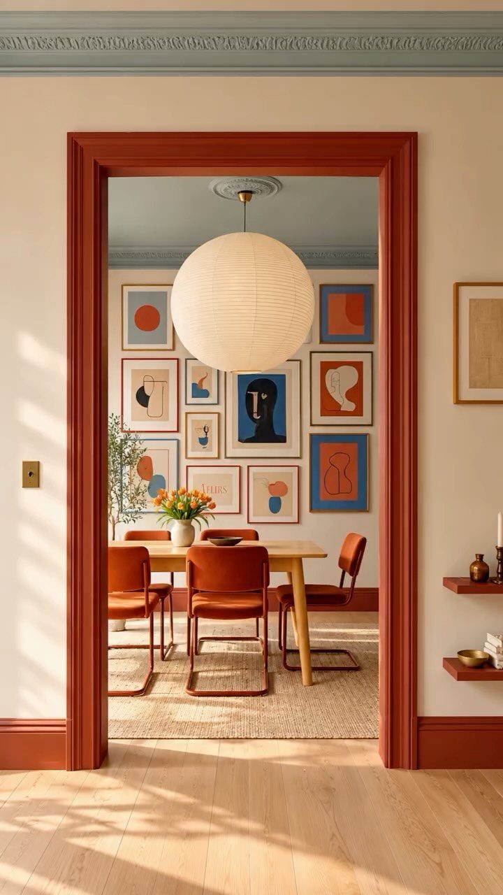
Art gives you color and a chance to say something about what you care about. A gallery wall spreads that color across a larger area, and mixing frame sizes keeps it from looking too formal.
I hang pieces at eye level and leave breathing room between frames. Start with the largest piece and build outward, laying everything on the floor first to test the arrangement.
Framing prints yourself keeps cost down, and you can swap them out when your taste changes.
5. Blue and Green
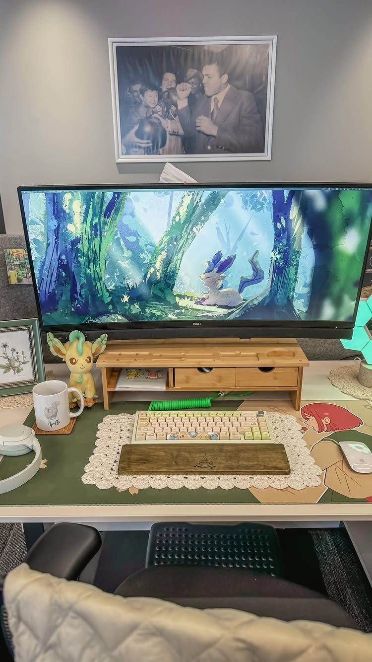
Blue and green work well together because they sit next to each other on the color wheel and both pull from nature. The combination feels balanced without much effort.
I use them in rooms where I want a quieter mood, like a bedroom or a home office. Darker shades of both colors add depth, while lighter versions keep the space feeling open.
If you already have a lot of wood or neutral tones, blue and green layer in easily without clashing.
6. Layer Neutral Shades
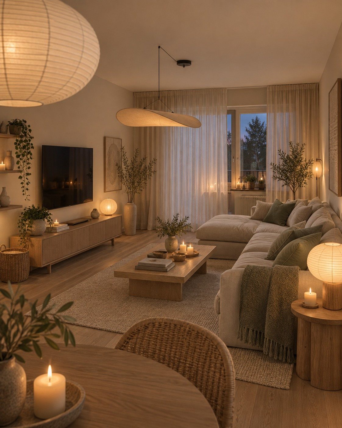
Sticking to one color family but varying the shades gives you a cohesive look that feels intentional. Cream walls, a beige sofa, tan pillows and an off-white throw all read as deliberate rather than monochrome.
Texture makes this approach work. Linen, wood, woven baskets and soft knits keep the space from feeling flat even when the colors stay close.
I add warmth with lighting, since cooler neutrals can feel sterile without it.
7. Use Dark Greens
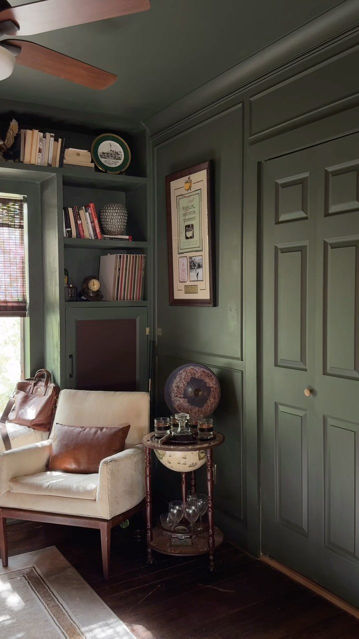
Dark green on walls or cabinetry anchors a room with color that feels grounded rather than loud. It reads as both moody and natural, which makes it work in libraries, bedrooms or dining rooms where you want depth without darkness.
The shade matters.
Forest green and hunter green hold up in spaces with good natural light, while very dark greens can feel heavy in a dim room. I test samples on the wall and watch them through the day before committing.
Pairing dark green with cream, brass or natural wood keeps it from closing in.
8. Use Chocolate Brown
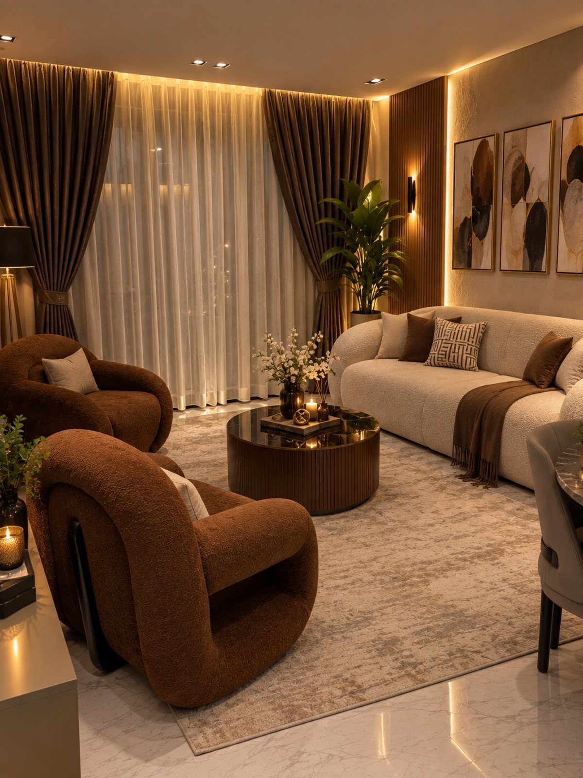
Chocolate brown adds warmth and works as a neutral that still has presence. It pairs well with cream, tan and softer browns, so you can layer it into a room that already leans neutral without starting over.
I use it in furniture when I want something that feels substantial but not stark. A brown sofa or chair grounds the space and shows less wear than lighter upholstery.
The tone skews cozy, which suits living rooms and dens better than spaces where you want a lighter feel.
9. Use a Colorful Rug
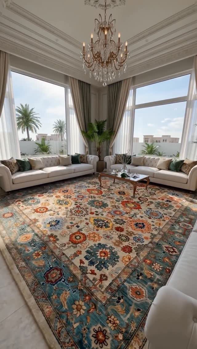
A rug lets you commit to color at floor level, which feels less permanent than painting or reupholstering. If the palette stops working, you roll it up and start over.
Pattern helps here because it pulls in multiple colors at once, giving you options for what to echo in pillows, art or smaller accessories.
I look for rugs where the background color works with my existing furniture, then let the accent colors guide the rest.
Size matters. The rug should anchor the seating area, with at least the front legs of each piece on it.
10. Add a Colorful Sofa
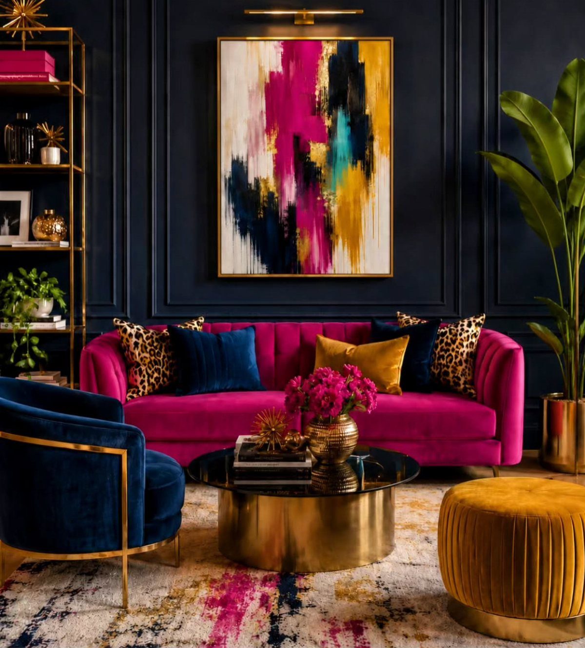
A sofa in a bold color becomes the room’s focal point and sets the palette for everything else.
It takes confidence because you are committing to that color in a large, expensive piece, but it also removes the guesswork about what the room is supposed to feel like.
I build the rest of the room around it, pulling one or two accent colors from the sofa fabric and keeping walls and larger pieces neutral. That lets the sofa hold the attention without competing.
Velvet or textured upholstery makes the color feel richer and less flat.
11. Paint the Walls
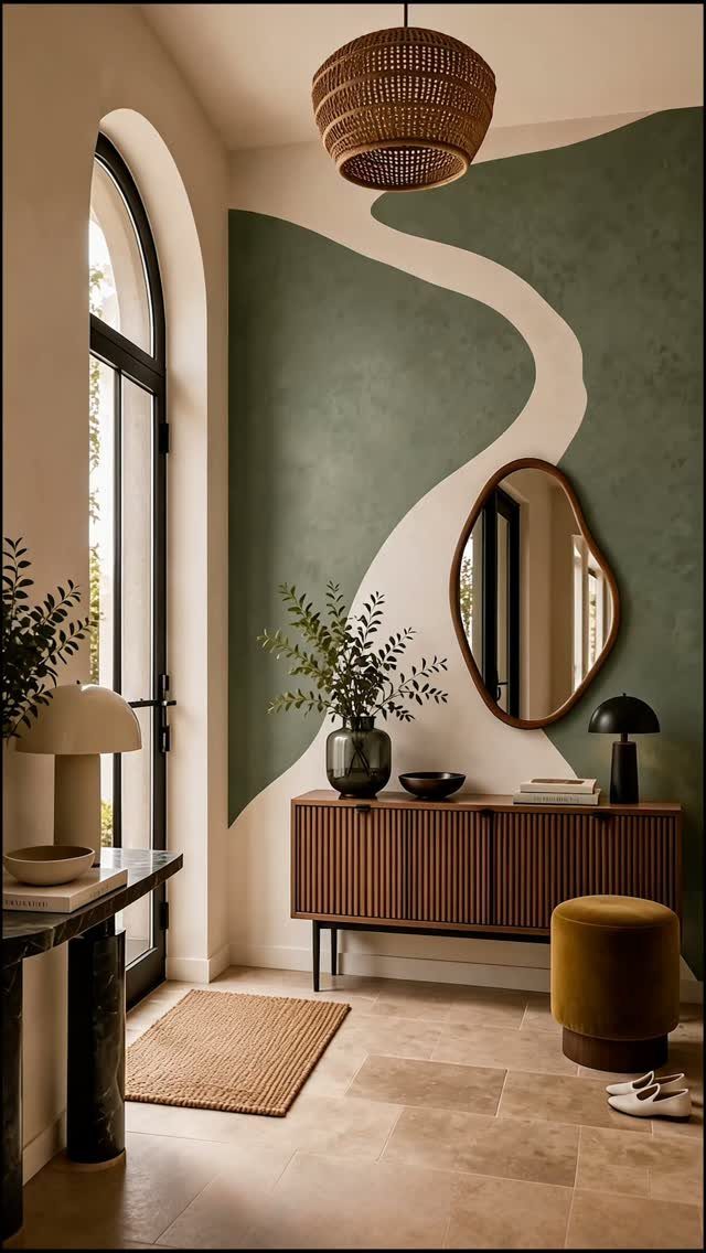
Painted walls put color into the largest surface in the room, so the effect is immediate and complete.
You can go bold with a single accent wall or cover the whole space if you want the color to define the room.
Organic shapes or color blocking turn the wall into a feature rather than just a backdrop. Tape and a steady hand get you there, or you can freehand the edges for a softer look.
Primer and 2 coats of paint usually cover well.
12. Use Patterned Textiles
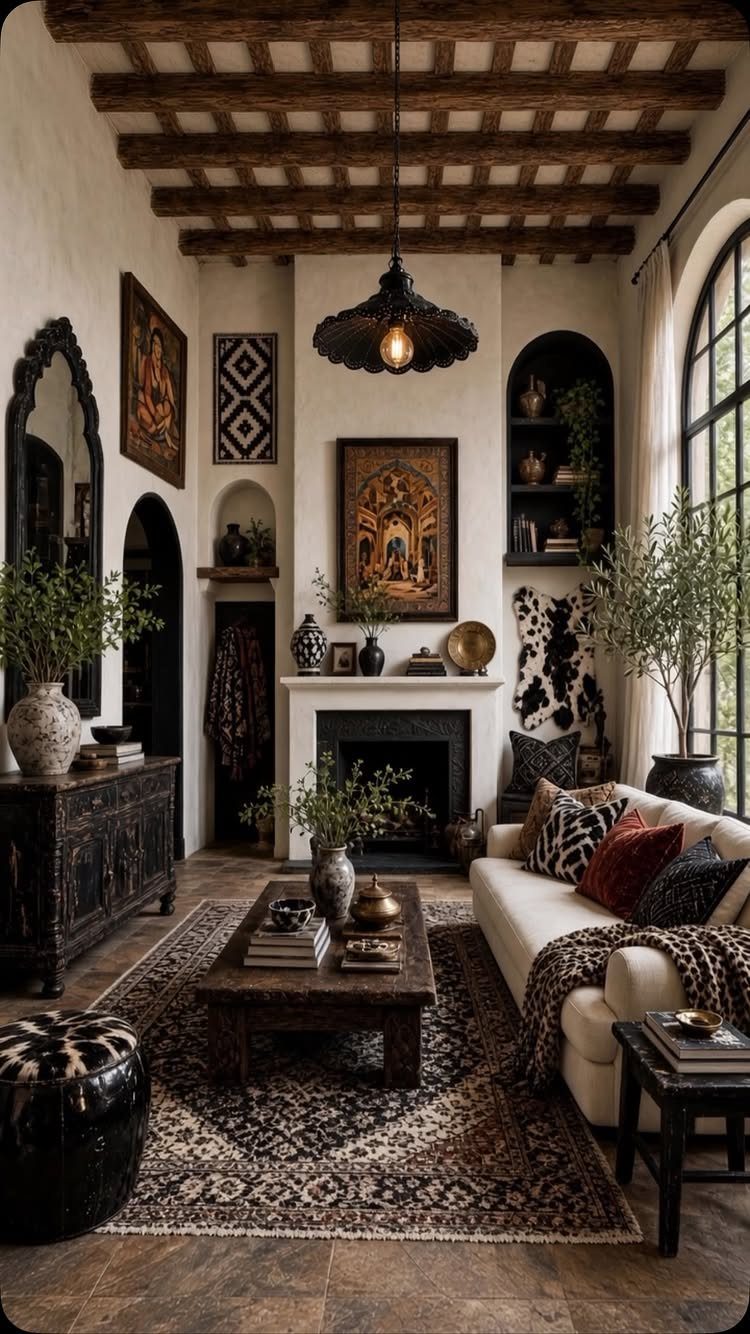
Patterned textiles bring color into a space in a way that feels layered rather than matched. A rug with several colors gives you a palette to pull from, and patterned pillows or throws repeat those tones without looking too coordinated.
I mix patterns by varying the scale. A large geometric rug, smaller floral pillows and a solid throw keep the room from feeling busy.
This approach works well when you already have neutral furniture and want to add personality without replacing anything major.
13. Paint the Cabinetry
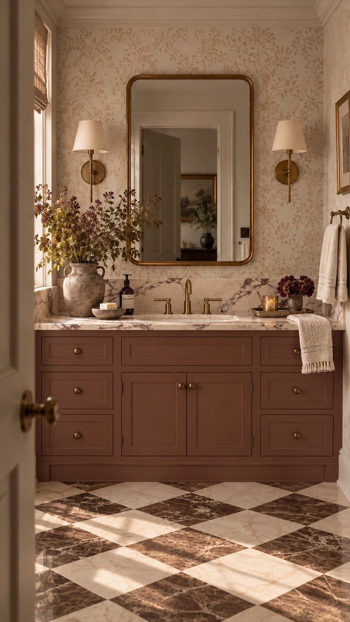
Kitchen or bathroom cabinets in a bold color shift the entire room without replacing anything. The surface area is large enough to make the change feel complete, but the cost stays lower than new cabinetry.
I sand, prime and use 2 coats of a durable paint made for high-use surfaces. The prep takes longer than the painting itself.
This works best when the cabinet boxes are in good shape and you just want a new look. If the doors are damaged or the layout does not suit how you cook, new cabinets make more sense.
14. Add Colorful Tile
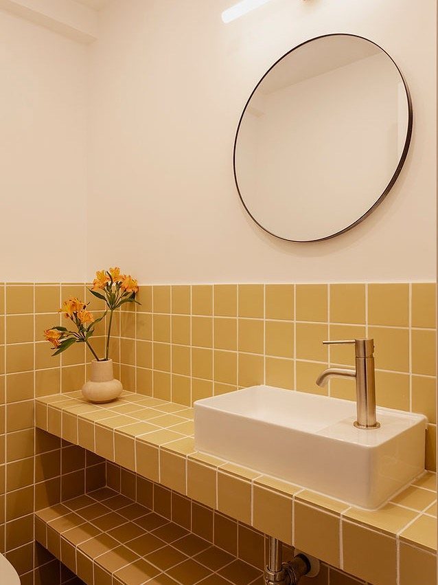
Tile in a kitchen backsplash or bathroom puts permanent color into a small, high-impact area. The material holds up to water and heat, so the color stays bright longer than paint in the same spot.
I use it where I want color but need durability. A tiled counter or wall becomes the room’s focus, so the rest can stay neutral.
Installation requires cutting, spacing and grouting, which takes time and some precision. If you are renting or want something temporary, peel-and-stick versions exist but do not last as long.
Account for Room Lighting
Natural light changes how color reads on your walls and furniture, so the direction your windows face matters. North-facing rooms get cooler, more even light throughout the day, which can make colors feel a bit washed out.
South-facing rooms get warmer light that intensifies color. A room with windows facing east gets its strongest light before noon, while western exposure peaks later in the day.
I match the palette to the light.
Warm tones like terracotta, cream and soft yellow balance the coolness in a north-facing room. Cool tones like blue, gray and sage keep a south-facing room from feeling too hot.
The color at noon will not be the color at five, and you want to like both.
If you want the rooms in your house to feel connected, keep the temperature of your palette consistent.
All warm or all cool, with neutrals and wood tones that repeat from room to room. The dominant color can change, but the undertones should feel related.
Frequently Asked Questions
How do I color coordinate my room?
Pick a neutral backdrop for walls and large pieces, then choose one or two accent colors and place each in at least three spots.
Pull those accent colors from a patterned rug or a piece of art to tie the room together. The repetition keeps the space from looking random.
How many colors should a room have?
Three to four works well: a neutral base, one or two accent colors, and maybe a second neutral for depth.
More than that and the room can feel scattered unless you have a patterned textile holding them all together. Repeating each color in at least 3 spots makes the palette feel intentional.
Should every room in my house use the same color palette?
The rooms should feel related but not identical.
Stick with the same temperature throughout (warm or cool), carry your neutrals and wood finishes room to room, but let the main color shift. That connection matters more than matching everything.
How do I pick a color palette that won’t look dated in five years?
Build around neutrals and natural tones that hold up over time, then add trendier colors only in accessories you can swap out.
Go classic on the permanent pieces and save what’s on trend right now for pillows, blankets and framed prints you can swap out. Start with how you want the room to feel rather than what looks good in a photo.
Does the light in my room affect what palette will work?
Room orientation changes how color reads, so it matters. Rooms facing north pull cooler and want warm colors to balance them; rooms facing south get warmer light and take cooler palettes better.
Paint samples on the wall and check them morning through evening, because what you see at lunch won’t be what you get at dusk.
What’s a good neutral palette that doesn’t feel boring?
Use different values of one color: cream on the walls, beige on the sofa, tan pillows, an off-white blanket. Warm lighting stops cool neutrals from reading cold.